lo
lo
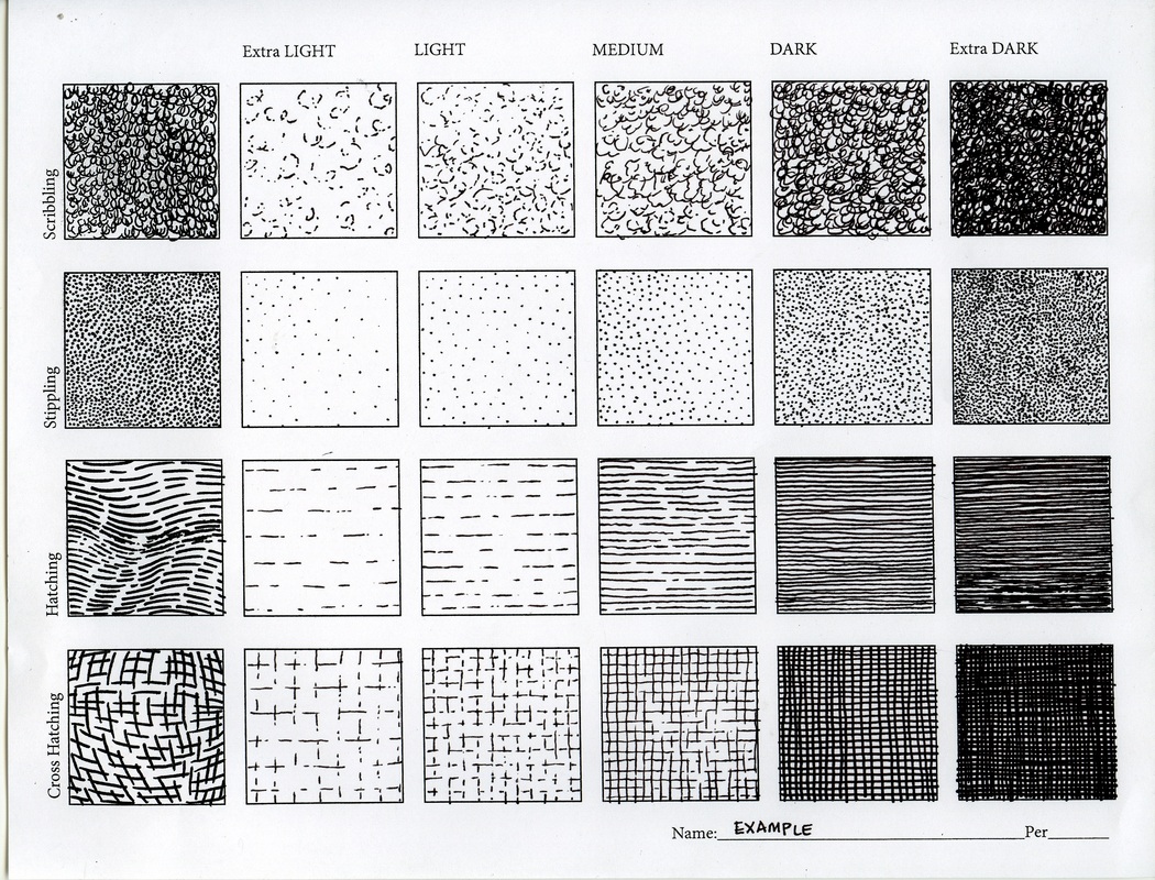
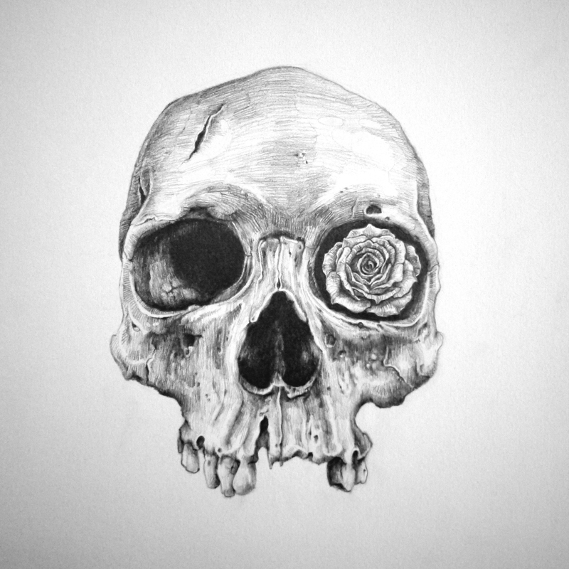
Value study
Reply
lo
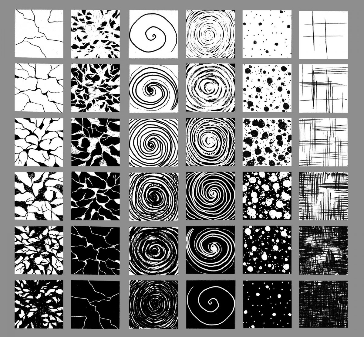
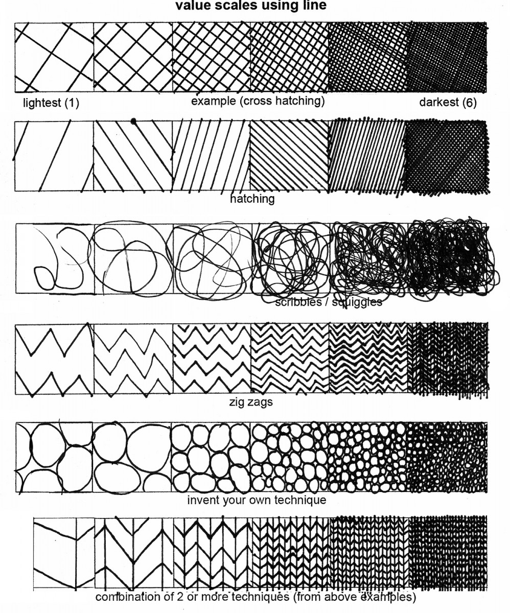
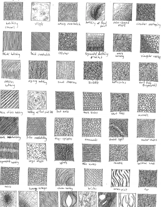
In this exercise try creating multiple steps in value, using the same mark making technique. See the swatches below as examples. Create an abstract design and fill in the design using these different swatches of value. Try patterns, stippling, hatching, and crosshatch. Try ink wash techniques as well.

Assignment 2: Object Staging, Part II — Concept Sketches
Description
You’ll now complete the preliminary steps of the illustration process, refining your 3 best Object Staging Thumbnails into Concept Sketches.
Refine your thumbnails following class critique. Be sure to Submit the Concept sketches in Assignment 2, for approval!
Specifications
Directions
Be sure to Check the pencil rough for any tangencies or poor cropping.
In Preparation for the Society of Illustrators Visit next week, read about the current exhibitions on view at the museum

Then Choose ONE artist to research further. Write a short blog post (150 – 200 words) with an example of their work. Explain why you chose the artist and the work. Explain the importance of the work and if you can include details like the time period the artist is (was) working in, cultural significance, and working process.
Be sure to come ON TIME TO THE MUSEUM, October 10th at 2:30 pm. Cost of entry is 3$ for students with ID.
The Society of Illustrators is located at:
128 East 63rd Street (between Park and Lexington Avenues)
New York, NY 10065
 Fill 4 pages in your sketchbook with things YOU find scary or creepy. This is totally up to personal interpretation! Theres no right or wrong! BUT be sure you draw FROM OBSERVATION.
Pay attention to line weight! Try to use value to SHADE your drawings!
I like the exercises they actually helped me a bit and I tried most of the inking on Bristol. The only thing that I need to work on a lot is curves and keeping the pen 45 degrees.
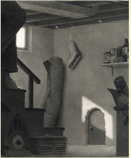
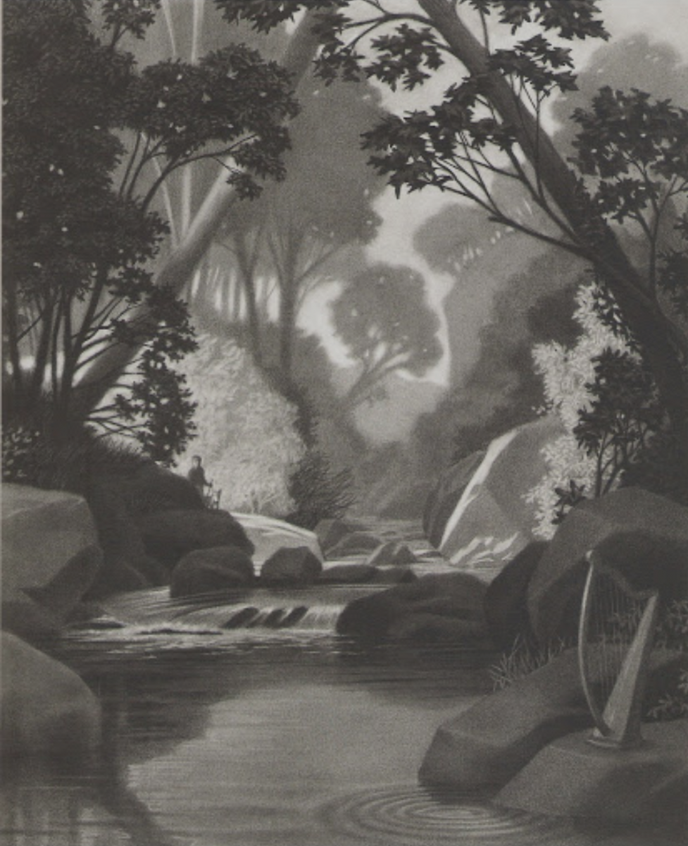
I chose this piece because I really liked the lighting in this illustration. The caption that comes with this is:
“His heart was pounding. He was sure he had seen the doorknob turn.”
This light, which is coming through the window is leading the reader’s eye to the door. This along with the fact that the rest of the room is dark really illustrates the erie feel of the door.
What’s behind the door?! We will never know…
The OpenLab is an open-source, digital platform designed to support teaching and learning at City Tech (New York City College of Technology), and to promote student and faculty engagement in the intellectual and social life of the college community.