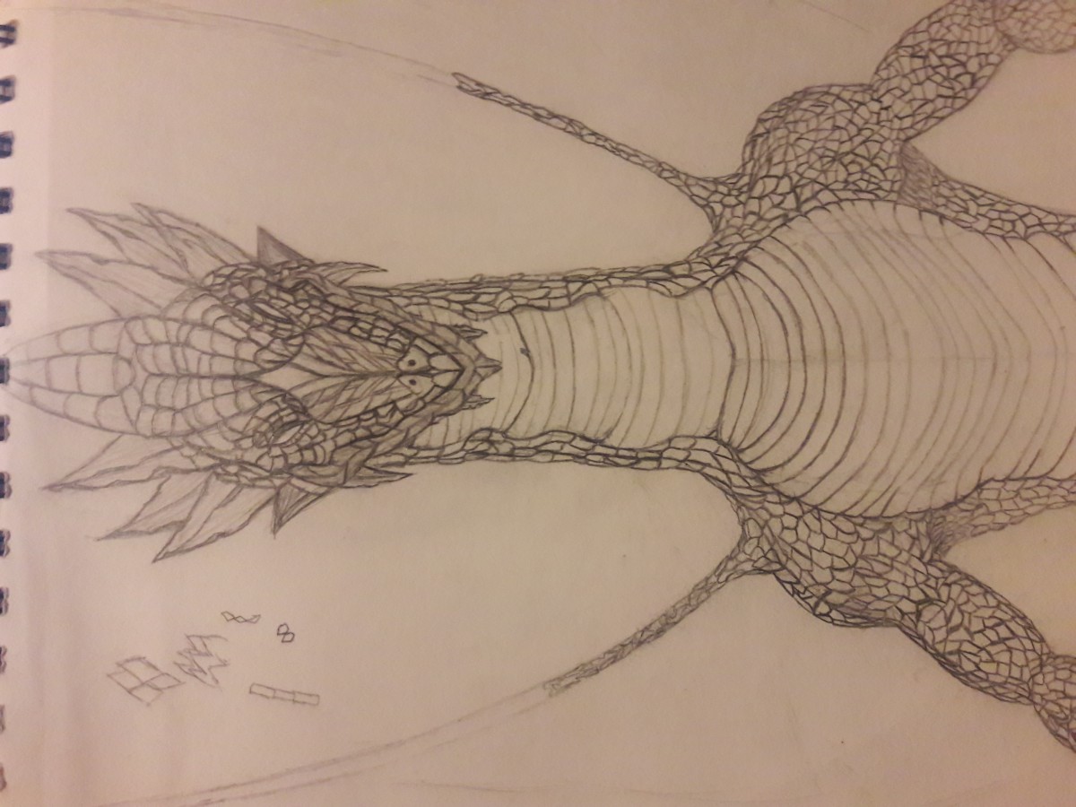
Revised Concept Sketch
Reply
When I got up the stairs, I glanced at the picture on the wall. I wonder why there was a photo here. so, I stop going and looked carefully at this picture.
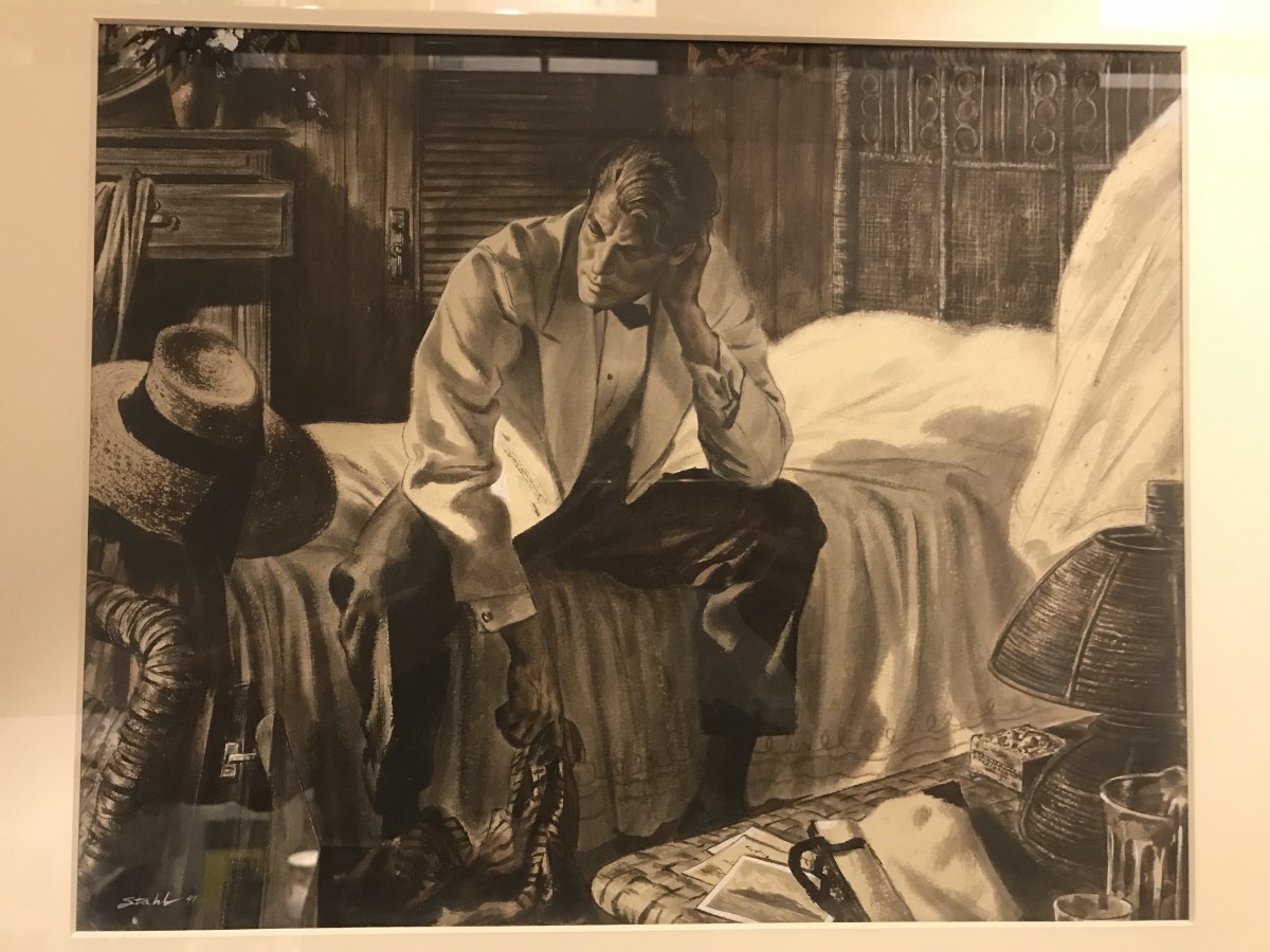
Benjamin Albert Stahl, “Aloha Means Good-by” Illustration for the story by Robert Carson, post at Jun 9, 1941.
It really look liked very old and yellowing phonographic . Let me marveled at the furniture and character on the value, they have a strong sense of hierarchy, especially that lampshade, its texture in the light of the irradiation had a lot of different changes. The details of all the character and the background were realistic. Such as the protagonist’s hand on the back of the prominent blood vessels, and every little things could be distinguished, like glass, purses, photos and stationery. I believed that the author’s character is very serious.
The use of value to show the reflection and shadow, making the characters more vivid. Let me feel the character was deeply thinking that the owner of the scarf. Although I do not know the story, but the room meticulous description of the characters and clothes, you can determined the characters came from outside.
“Benjamin Albert Stahl (September 7, 1910 – October 19, 1987) was an American artist, illustrator and author. He showed precocious talent, winning a scholarship to the Art Institute of Chicago at age twelve. His artwork appeared in the International Watercolor Show at the Art Institute when he was sixteen. He later taught at the Art Institute, as well as at the American Academy of Art, the Art Students League of New York, Brooklyn’s Pratt Institute and at various universities”
When he died, the news was on the New York Times, One of his colleagues, the artist Norman Rockwell, once said, ”We are but illustrators, but Ben Stahl is among the masters.”
Visiting the Society of Illustrators was very inspiring. The illustrations that I was inspired the most was done by Orson B. Lowell specially “Family arrives at party on the wrong evening”. The illustration is about a fancy-dressed up party that turned out to be unexpected. Lowell’s work made me realize that there is no limits when it comes to drawing. He used three sheets of drawing paper and put them together as one final drawing which I never thought I would see such technique. It is amazing how he perfectly continued to the next page as if he never left the first.
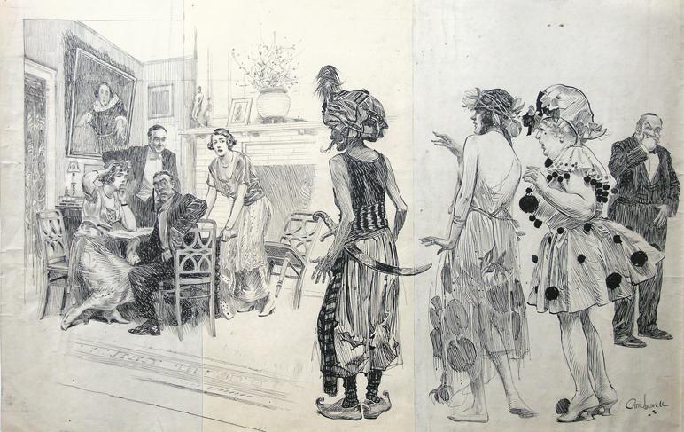
I always thought that this type of illustration wouldn’t have any mistakes until I saw white spots with corrections through the drawings. That shows that every illustrator have a tough time to come up with a perfect art work. Lowell shows humor by the expression shown on the people’s face when they see their family on costumes. Furthermore, Lowell’s ways of drawing has taught me how amazing it is to work with ink by just doing cross hatching with lines although it takes a lot of practice and dedication to make a perfect piece of art.
Visiting the illustrator’s society was a very interesting event for me. When I was going there, most of all I was interested in the question of how with the help of ink and a pen it is possible to create such voluminous and informative pictures. And I found out that as well as in the work with oil paints, the distance from which we look at the illustration has great importance. The further the viewer is the more real the picture. Near it, we can see how scattered the strokes of the pen are. Also, it was interesting to know how the illustrators made corrections in those days when there were no computers and printers yet. I noticed a few pictures which have been cut out and then glued areas with corrections.

In addition, in the process of studying the exhibition, I suddenly found that many of the depicted women, despite a fairly wealthy life, have some inexpressible pain in their eyes.
I wondered why and that’s what I found out; before the First World War, many women wore corsets that tightened the body so that it was difficult to breathe. So the life of female aristocrats was hard too. However, here we can see some illustrations after the war, already without corsets, completely different faces.
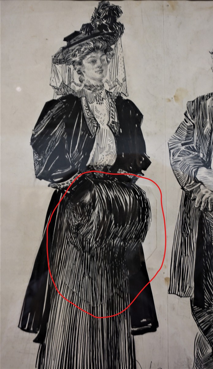
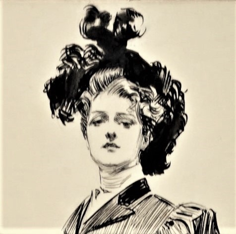
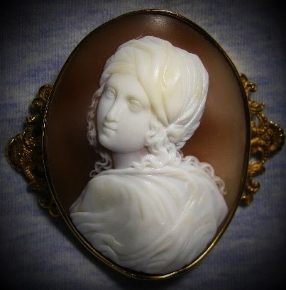
Most of all I liked the portrait of Gibson’s girl. The work is done very cleanly, accurately reconciled direction lines and composition. The image is somewhat reminiscent of the cameo of the ancient work.
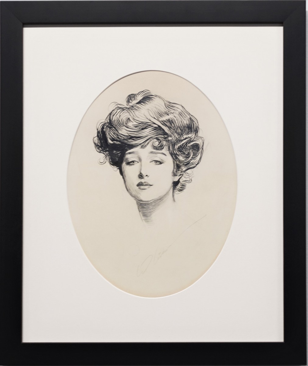
This illustration is not only masterfully executed portrait is an iconic work which simultaneously reflects the historical moment and it is also an enduring artistic value for all times. The prototype of the portrait was the well-known model of the time Florence Evelyn Nesbit, but the sadness in her eyes, not about the corset, she really had a hard life. And it is paradoxical that she served as a model for imitation of a whole generation of women in that times.
While visiting the NY Society of Illustrators I came across one work in particular that stood out and really spoke to me on a personal level. ‘Girlhood’ by Siobhan Gallagher is an illustration that I think a lot of people can relate to and not just women. The way that the illustration is drawn out is very unique in a kind of a newspaper comic style and it is very simplistic and straight forward and easy to understand. I related to this on a personal level because I have experienced the scenarios drawn out in the illustration; no matter what I do or how I look sometimes, somebody or everyone will outright say that I’m doing something wrong or criticize me.
The illustrator Siobhan Gallagher, graduated with a BDes from Nova Scotia College of Art and Design University in 2012. She has previously worked at Penguin Random House and has been featured on Bust, Us Weekly, The Huffington Post, and Refinery29. She has also won the Society of Illustrator’s Silver Medal of Excellence in the single image category for her other illustration pictured below.
From what I have gathered about Gallagher’s overall illustration style, is based a lot around her personality, inner thoughts, or even her poking fun at herself or others with relateable moments that some people may go through (i.e. the silver metal winning illustration). The illustration that I chose was a scenario that was relateable and something that a lot of people experience and think about. I think that Gallagher definitely experienced the feeling of ‘not being good enough” or as she describes in the illustration “doing something wrong”. I also think her technique is very unique since it reminds me of those little newspaper comic strips that I mentioned earlier. I also think her drawing style stands out to me because the overall drawings of the human characters are very simple but when she wants them to stand out she makes them stand out when looking through her work.
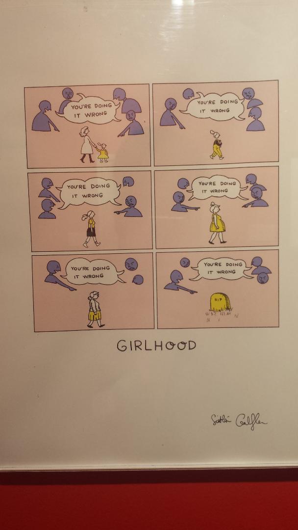
Illustration that Gallagher won a Silver Metal of Excellence for at NY Society of Illustrators:


The artwork that I chose was the ‘Gang Fight’ illustration by Ed Vebell. This piece was initially published in Sunday Mirror Magazine on July 10, 1955. Ed Vebell was born on May 25, 1921 in Chicago. It was evident at a young age that Vebell had a talent for drawing. After graduating high school, he won scholarships to three different art schools. Ed Vebell has lived an interesting life as an artist and outside of being an artist. He was a key artist assigned to Stars and Stripes in Europe and North Africa. He also had a chance to be one of the few artists to sketch the Nuremberg trials. Also, Vebell was an Olympic fencer. Vebell was a master draftsman with a physician’s knowledge of human and animal anatomy, which more than likely helped him with his illustrations.
In the Gang Fight illustration, Vebell used gouache on an illustration board to execute. The characters and the setting in the illustration give you a sense of the time period they were based off of. The fashion choice of the characters make you think about how different society was back in the day; as well as the old style lamppost. The red color choice of their clothes make the illustration pop more but it also ties in with the aggressive tone that the piece gives off. That’s something that really attracted to me to this piece. The simple connection from the color choice to the context of piece really made me interested. The old style setting also reminded me of the movies ‘The Warriors’ at first glance.
Poor Old Things! Strange That His Case Has Never Been Correctly Diagnosed. Illustration by Orson B. Lowell for the LIFE magazine in 1907, Lowell depicts the changes of society, that slowly but surely progress to be more including and progressive for woman. it depicts the more openly higher education for woman and how society may have still force the role’s of traditional society, the change was to be imminent. The way that Lowell lines and the variations of closeness to each for variation of shades and the smoke presented in contrast of the graduation cape will make it hard for most to find a solution to this problem but Lowell finds a way to solve this and more.
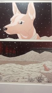
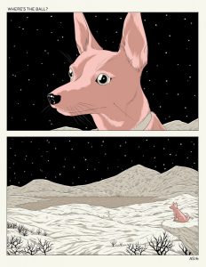
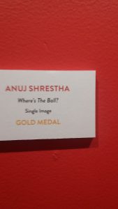
Where is The Ball by the illustrator and cartoonist Anuj Shrestha. the illustration depicts a puppy dog looking into the abyss under a night full of stars, in what seems to be a desolated dessert valley with no trace of civilization and with one only question “where is the ball”. while not depicting a literally post apocalyptic dystopian future, the scenario that Shrestha depicts is of the one dog that seems to be the only soul over the face of the earth, with no trace of any other human to play catch, wondering the one only question where the ball could be? where humanity was left or got lost? While taking symbolism to its maximum core, I see the meaning of this illustration under the lenses of nihilism vs existentialism. we can view the star-full night as metaphor for space and its infinity, the lack of any trace of civilization can be view as the position of humanity in thin infinite space, and how insignificant can it be, and over all we can take the question asked of Where is The Ball as where is the purpose or meaning to existence. in the long run we can see this illustration as the battle of giving purpose or meaning to our lives and actions, and how soul crushing and lonely it can be when we don’t find that purpose that motivated us to keep forward.
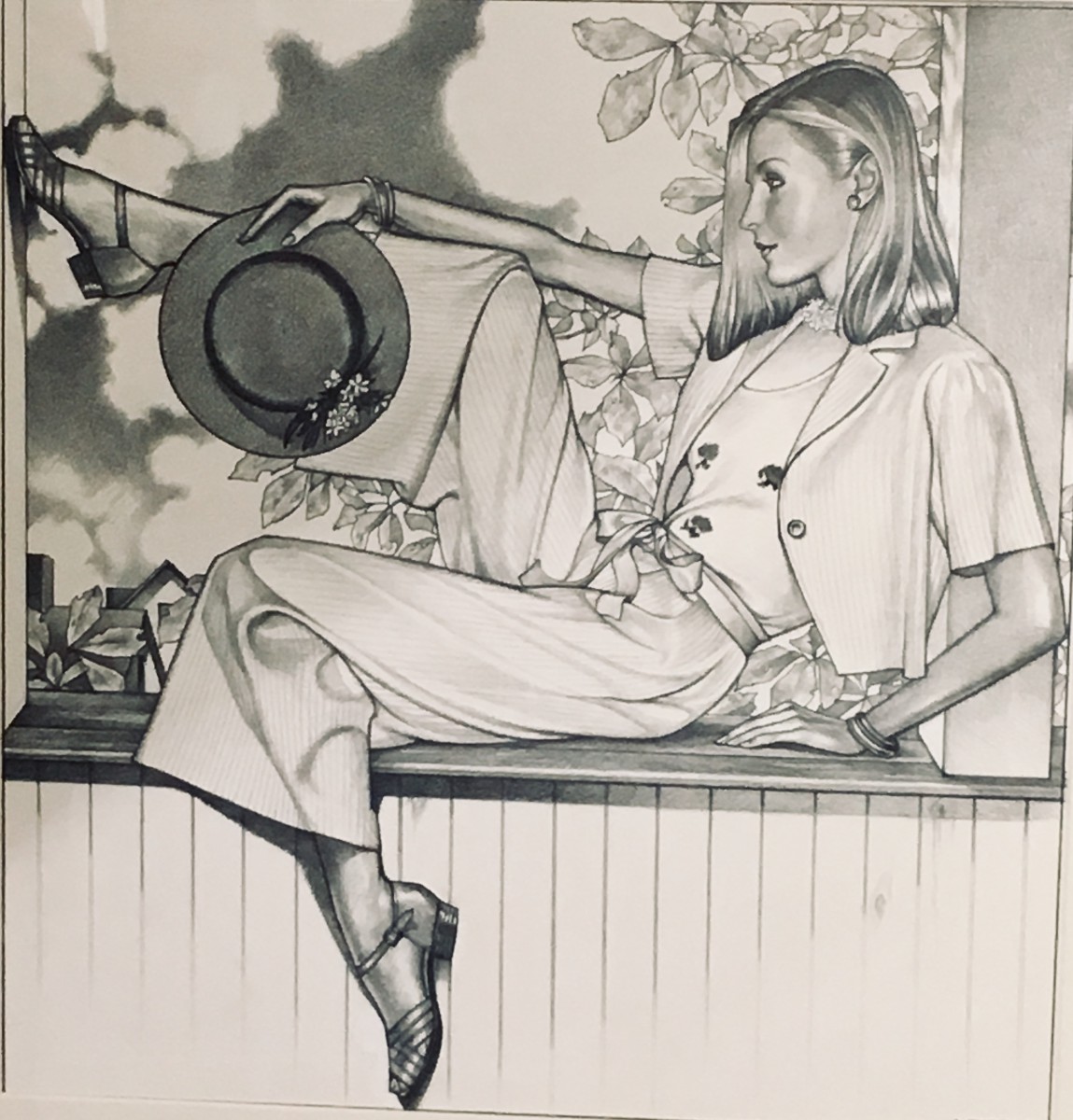
I was completely enamored by the atmosphere when I first stepped into the Society of Illustrators. In fact, I was inspired by a few pieces at the museum. I fell in love with the “On the Porch,” piece by George Stavrinos. Coming up the landing it would be easy to miss, but the shading and the position of the model in the composition really captured my attention. It was also fascinating to learn that it was a fashion ad for Bergdorf Goodman. This piece really spoke to my fashion background, which is something that will never die. I absolutely love the folds in the fabric, which is something that I need to work on.
George Stavrinos was an American illustrator and graphic artist. He was well known for his advertising pieces for Bergdorf Goodman, and even magazines such as GQ and Cosmopolitan. His work exudes luxury, drama, elegance, sex appeal, and the women he drew have a powerful presence. I could almost say that the women in his illustrations represent the old Balmain woman, (one of my favorite fashion houses) way before the the takeover of creative director Olivier Rousteing. He also managed to make the fabric of his rendered pieces look so soft. It’s almost imagine what the fabric would feel like. After researching his work I was pleasantly surprised when I stumbled across his process. It was amazing to see how my creative process is similar to that of a great artist. Stavrinos’ process included lots of photographs and sketches before producing the finished drawing. Stavrinos will definitely be an artist that influences my work.
The OpenLab is an open-source, digital platform designed to support teaching and learning at City Tech (New York City College of Technology), and to promote student and faculty engagement in the intellectual and social life of the college community.