Pen and Ink Illustration: an Introduction

We can trace pen-and-ink illustration’s roots back to the very earliest illuminated manuscripts.

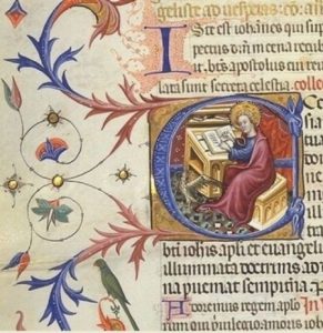
An illuminated manuscript is a manuscript in which text is supplemented by additional decoration. The earliest known examples come from the Byzantine Empire, from 400 to 600 CE.

1472596584762

Illuminated manuscript

But regardless of the antiquity of the medium, pen and ink are used all the time by contemporary illustrators, with a spectrum of different results.

1472596592999

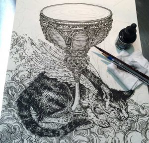
Yuko Shimizu Work Process Shot

Illustration and the Art of Printing

Illustration’s development has paralleled the art of printing and reproduction, with very specific moments in history periodically reinventing our medium. We can boil these moments down to a few landmark inventions:

  • the printing press
  • color lithography
  • photography
  • digital printing
  • digital media

Arguably, the invention of the printing press is still the most important thing that has occurred in the history of our art form.

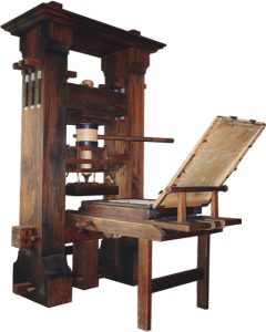
press

When Johannes Gutenberg invented the printing press, developing a movable type system in Europe between the years of 1440 and 1450, he completely revolutionized the world of human communication. He also initiated the marriage between illustration and publishing that still exists today.

1468354318083-1

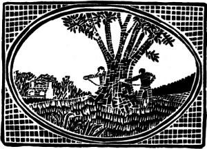
Just as type could be reproduced for print, so could images. The invention of illustrating by means of cut woodblock followed closely the invention of moveable types for printing.

1468354339982

Early Chinese woodblock print

It’s important to note that Chinese were the first by far to use woodblock printing, with the earliest known work dating back to before 220 CE. However, in Western illustration the first woodblocks date from the beginning of the 15th century and the invention of Gutenberg’s press.

Gutenberg added illustrations—usually woodcuts—to his printed books. Very soon after that, books with woodcut illustrations became commonly available.

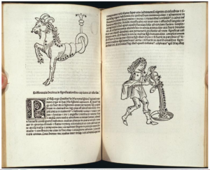
These illustrations were limited to black ink on white paper, forcing illustrators to render subject matter and to represent dimensionality using only lines, leading to the development of hatching in the pages shown here.

1468354365186

Illustrations by Erhard Ratdolt, 1488, in a book written by Persian astrologer Albumasar

Week 3 Reading

In the article “Demonic world with Ghost” Eric fortune shows the process towards his ending piece. From light sketching to then using his references and reasearch to make his piece come to live. In his process he mentions the importance of playing around with colors like he did with his scratch paper, that way he can keep track of the consistency of all colors.

The Role of Reference response

In Eric Fortune’s case he used an actual picture of a person as reference. He took a picture of this person in the pose he wanted where he wanted and drew his piece from this photo reference. He transfers the sketch to watercolor paper, finding it helpful to correct anatomy on better paper. Another way Eric uses reference to is leave the drawing in a sort of rough state so as not to disturb the paper with erasing. He tries to get enough information from the referenced pencil drawing portion of the work, letting the paint do some of the detail work later on.

Week 3 Reading: The role of reference

Article “Demonic world with ghosts” by Eric Fortune describes the steps in the process of creating an illustration. The first stage is an idea and the creation of an initial picture. Then the author uses photos/references from the real scene to determine the positions of objects in the illustrations, light sources, colors, and textures. This helps him save time and not spoil the paper with unnecessary erasures. Then he starts painting the objects in the illustration. Photos also help him choose colors for some parts of the illustration. Here he writes about the technique that he uses to create a marble effect for the table and the color selection for the image of bruises on the hands of the girl.

Week 3 Reading Response

In Yuko Shimizu’s blog post her role of reference was Google Maps. It was kind of surprising for me at first that someone used that as a referenced. It then took me a second to realize that was a pretty genius resource to use as a reference since you can look up pretty much anywhere in the world and explore it from all dimensions without leaving the comfort of your home. The stages that Yuko went through to develop her work were at first pretty straight forward and common for someone that just wants a general reference of an area. But she then realized that Google images gave her just that; a general reference. She then realized that Google Maps has street view so that she can explore streets virtually and get details that she could not with just photos. Even if she were to visit the locations in person there are certain angles and dimensions that she could not view. So using Google Maps as a virtual reference for scenery is a great idea.

Drawing from reference

Yuko Shimizu used Google Maps as a reference tool for an Illustration she was doing of a New York cityscape. By using Google Maps she was able to capture different angles and smaller detail than she was able to see in other reference images. Yuko used the reference to form her initial sketch since she wanted to showcase a very particular area of the city. Through this form of reference, she was able to get different vantage points with the click of a button, without having to deal with the distractions and obstructions drawing from life can have.

Week 3 Reading: The Importance of Reference

In Yuko Shimizu’s piece for Mother Jone’s magazine she used Google Maps as her reference. She mentions that with Google Maps she was able to digitally walk around and get reference of the buildings. This made it easier for her because she said that she wouldn’t have to sit somewhere for hours at a time and let other people see her rough sketches. With Google Maps Yuko was also able to get references of buildings that photographs or other images couldn’t get. This allowed her more freedom to move around and work on her project. Yuko used Google Maps to guide her during her drawing phase. She says that she was literately drawing while walking around in Google Maps. Lastly, she also used characters in her illustrations. Yuko mentioned one for her students and was inspired to draw a character like her. I don’t know if this would count as reference or inspiration but either way the illustration came out really well.

Product Illustration

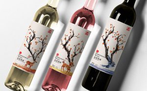
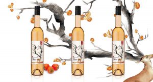
These are  product illustrations of a kind of Chinese persimmon wine. The persimmon  tree is the antlers.  This idea is good,  and result is great, it looks like watercolor or ink printing. That makes the illustration is  hyperbolic, but it is beautiful and layered.

Response to the readings

Reading 1

While I was reading this article, the first image came out of my mind was a wine bottle design named Empire. It gave me a very strong feeling, full of impacts and incredible amazing that caught my eyes at first from a page with different labels. So I completely think that eyes catching always plays an important role when it comes to product design. People might forgot the taste of the beer,the soda, or the wine…but there are always memory left behind the illustration from the design. The illustration tells a theme,a story or even a single word. When the color add into it, it’s not as 1+1=2. I still strongly remember the design of the Empire wine, with black or white background, golden or black dragons only, it’s very unforgettable,and I think this is the power of illustration when it comes to eyes catching design.

Reading  2

I like the design “Freedom to Read.” Jillian Tamaki mentioned two things I founded interested in her process. First, come up with different words and draw out thumbnails even though they might look funny. I think this is a good way to practice creativity and combination of ideas. Second, resources are important. We can fill our idea by looking around the resources. From the design “Freedom to Read,” I can see the influence from children books, both the style and the concept.

Reading # 1 Response

I do not drink beer, but, as far as I know, quality beer is a proven technology. Therefore, to date, most manufacturers do not participate in the competition for the quality of beer, because they already have it. They try to attract buyers by giving them a “circus” because they already have “bread”, that is, beer. An exquisite variety of tastes and quality of the beer is now complemented by works of art on labels. Because when we say that people have a taste, it’s not just about food or drinks, but also about the ability to perceive beauty. Thus, a simple walk in a supermarket past beer stands can be equated with visiting a museum of modern art, and you can choose one piece for yourself without paying a lot of money.