This part of the phase took me two hours to get done. It was a bit challenging initially because I had to find out how to adjust different colors together. I also had to find how to make different colors compliment each other and to make them into an illusions.
Based on the articles presented, it seems that color, is relative and distinct based on the eye. According to Josef Albers in The Magic and Logic of Color;
So color is open to interpretation, meaning in one way or another we all see color a little differently than what it actually is. Based on what I was able to comprehend about color theory, it appears that having your color makes it able to be interpreted differently. Color also has very distinct appearances and saturations. In short, color is the expression manifested into our own eyes.
I picked blue for sally because that just so happens to be one of her favorite colors. Also blue happens to be a primary color so i thought that blue for her would be very nice. Also blue is a shared color between us.
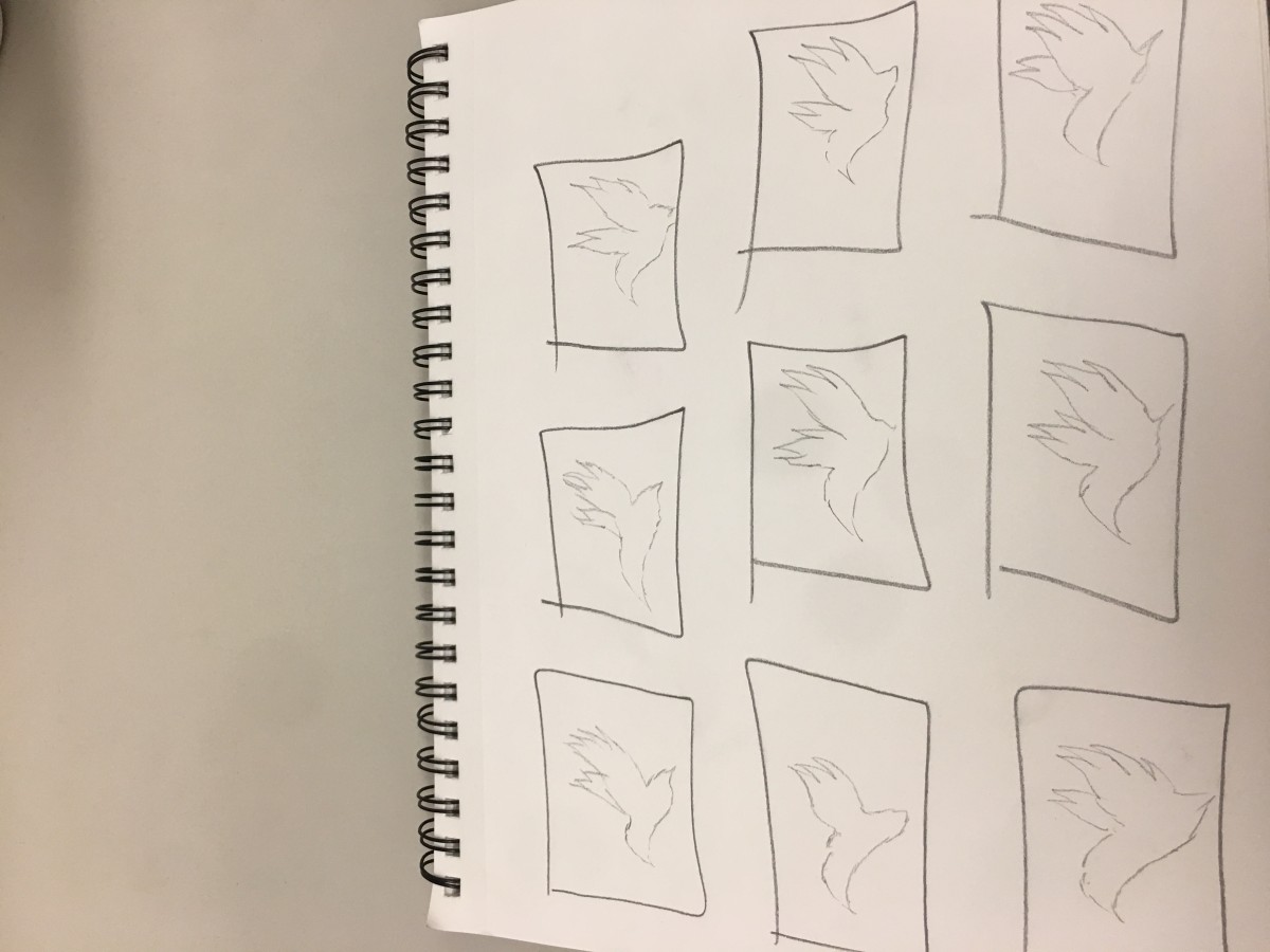
Step 3 – Icon Research Process
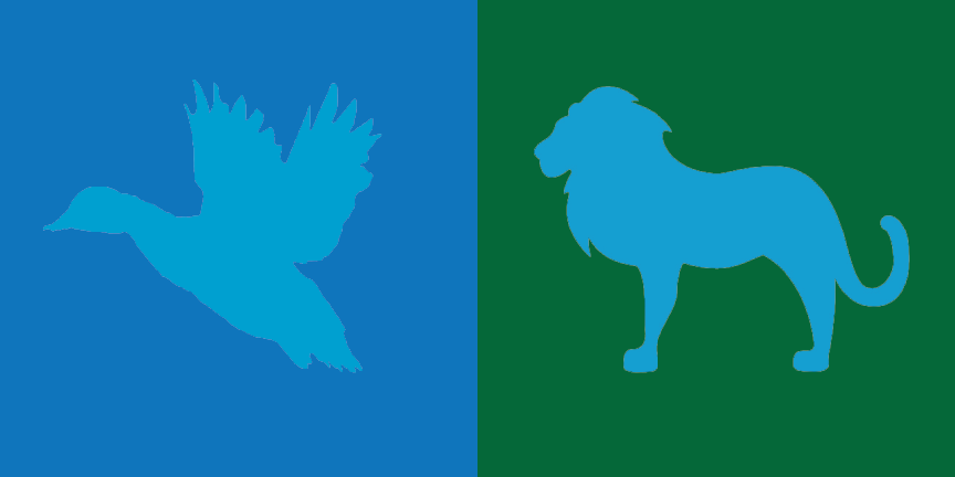
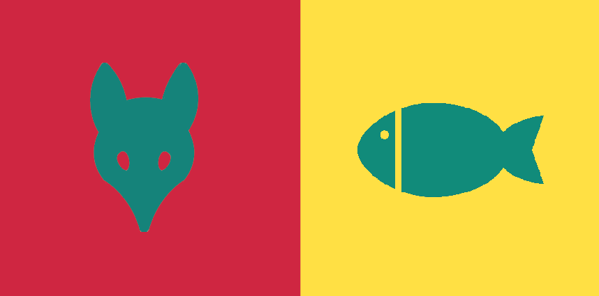
I chose to pick a duck for sally because shes free spirited. Shes also very calm in many ways. last but not least she told me that she likes ducks.
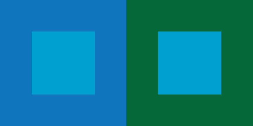
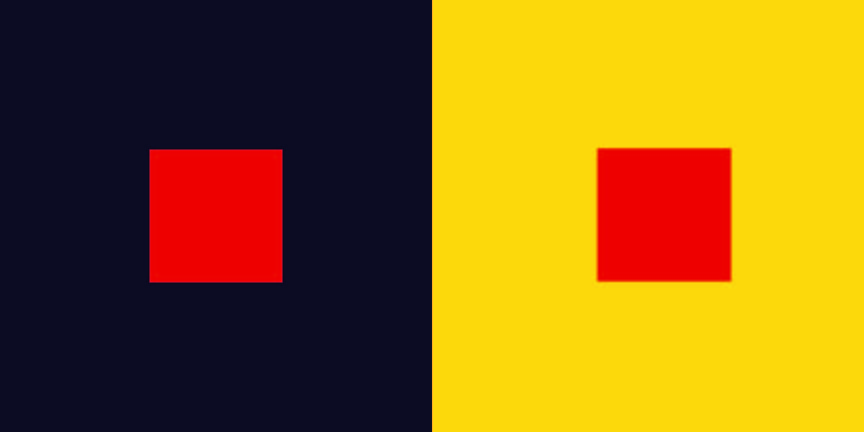
This project thought me the importance of the way we see colors within different backgrounds. Color is prolific and exciting. They are viewed in very different aspects of the color wheel. I also learned the importance of how compliment colors can create illusions to the naked eye. I learned the important lesson that Illusions worked best with opposites or complementary colors. The reason our(Olando and Evelyn) shared color(green) appears different is due to the fact that green complements red and yellow is a very different shade from tree. Its also important to recognize that colors appear different based on background color. To be honest I could’ve worked better on phase 2 of the projects where I had to make the same color appear to seem like different saturations on different backgrounds. All in all this project was long but it was something new.
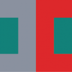
I learned how to see different values and hue changes. I could have done in terms of communication. It was a struggle to find a color that describes a partner that you haven’t really talked to. If I took more initiative to find out more I think the logo could have been created to better reflect the other person’s personality. I will apply to get better communication in my next project through actually taking the initiative to ask more questions. I applied to change the colors from both being muted to bright contrasting colors. At first, it was muted dark green and gray with a green in the middle. We changed it to a bright yellow/red and green in the middle because of green contrasts red. In the critique, I printed it out too small. I reflected the fish and then I changed the colors to create a higher value change, also a very subtle color change because there wasn’t any before. I’m not entirely sure how to make the hue change more vivid.
calm, relax, classical music, video games, friendly
Step 2 – Color Mockups
I picked gray for my partner Evelynn’s color because she likes gray and also she has a sort of neutral personality. The video that I saw on youtube explains gray as a neutral color and gray is also a color that’s desaturated and plus evelynn always wear neutral colors so that’s why I picked gray. The color we both shared was a greenish color that we both find amusing and drawn to. The medium green also gives the concept of calmness and relaxation.
Step 3 – Icon Research Process
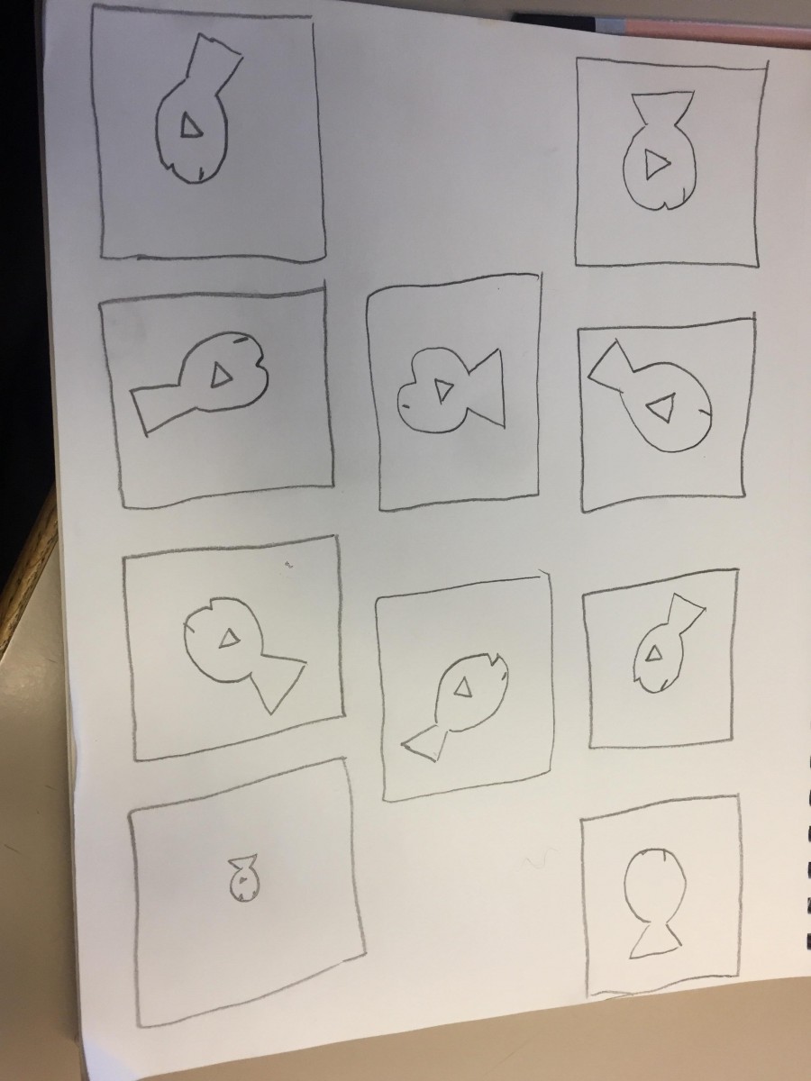
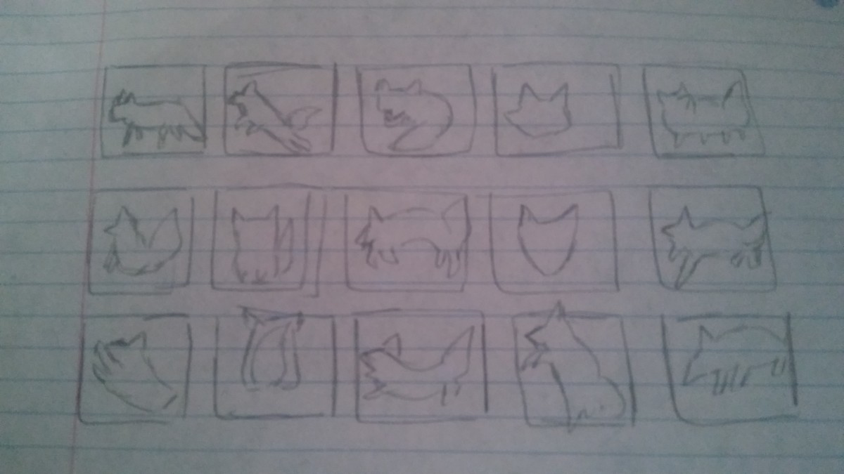
Lando’s Thumbnails
I chose a fish for evelynn because she interested in sea mammals. She also fishes as pets and she enjoys the simple things in life. Shes also a very calm person and shes nice.
Step 4: ICON MOCKUP
I learned the important lesson that Illusions worked best with opposites or complementary colors. The reason our shared color(green) appears different is due to the fact that green complements red and yellow is a very different shade from tree. Its also important to recognize that colors appear different based on background color.
This part of the phase took approximately2 hours to complete.
Based on the articles presented, it seems that color, which was once thought of as a constant, is in fact, relative. According to Josef Albers in The Magic and Logic of Color;
“In visual perception a color is almost never seen as it really is”
So color is subjective, meaning in one way or another we all see color a little bit differently than the person next to us. from what I was able to gather based on my very small knowledge of color theory, it appears that having your color, lets say a green, beside or surrounded by a darker color, preferably one very different from it, such as a black, can make the color look darker, than if it had a white background, and comparing them, it almost tricks your brain into seeing one darker or lighter than the other.
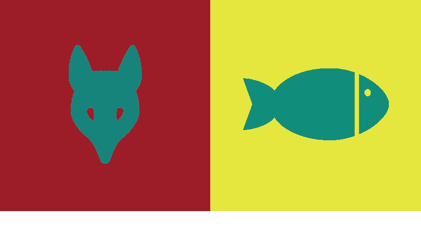
I picked the red color for my partner Olando because to me it resembles energy for sports. In the video it talks about being in a red room makes you talk more so I think red can also represent outgoing. Our shared color is green because our favorite colors are mint/lime and dark green. The green shows relaxation as well.
Step 3 – Icon Research Process
Evelyn’s thumbnails
I chose a fox to represent Olando because when I think of curious and active I think of fox’s being a hunter of some sort always moving. Besides that, a fox is generally quick when they move and that reminds me of Olando’s love for sports, the energy you can get from hip-hop, and being outgoing.
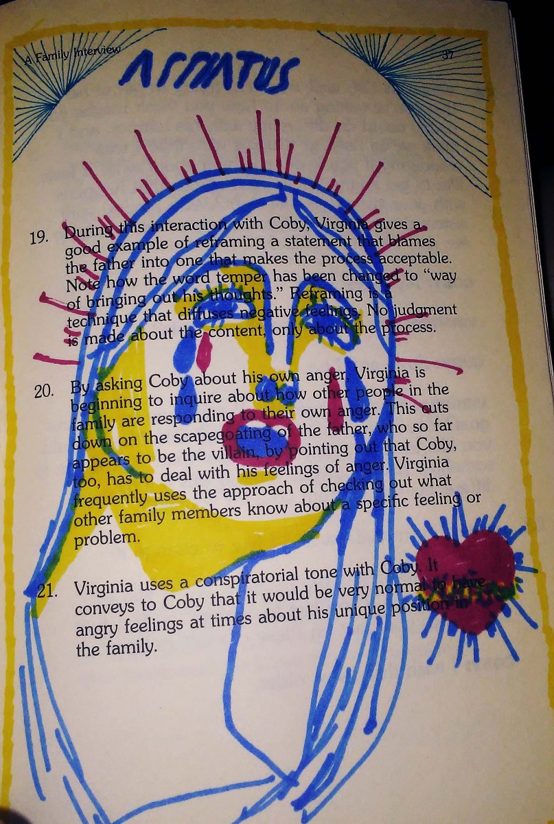
Here, we can see a woman, loosely resembling the Virgin Mary in a contemporary style, weeping, surrounded by a red halo, and next to a heart, with a yellow bored around it, and thin blue, vaguely gothic archways in its corners. This piece is centered around the word ‘Afflatus’ meaning a divine creative impulse or inspiration, and can be seen above. In a way this piece captures the definition, its Devine inspiration is the Devine.