Out of all the emails presented I was interested in Julia Hoffman’s work. Reason why is due to the use of 2-dimensional shapes to turn into an almost 3-D look, the use of red gradients also captures my eyes to … Read More
Category: Uncategorized (Page 2 of 6)
The type in the catalog is called Windsor, I don’t believe I’m a big fan of this type because I don’t like the tilts in the letters and how thick the ends are I think it is too playful personally … Read More
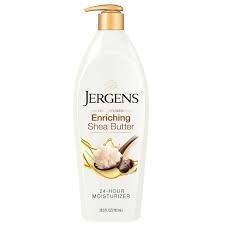
For some reason my computer would’nt let me insert the actual picture of the lotion. But I can see Garamond font as the title, ” Jergens”. The brackets on each letter, on the ” G” has the same characteristics.
on dropbox 😀… Read More
Mary Kate McDevitt
For my artist talk I hose to dive into McDevitt’s portfolio as her style and type work captured my attention the most due to its geometric and bold shapes and felt it is bet shown in this … Read More


