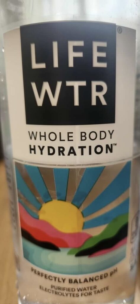
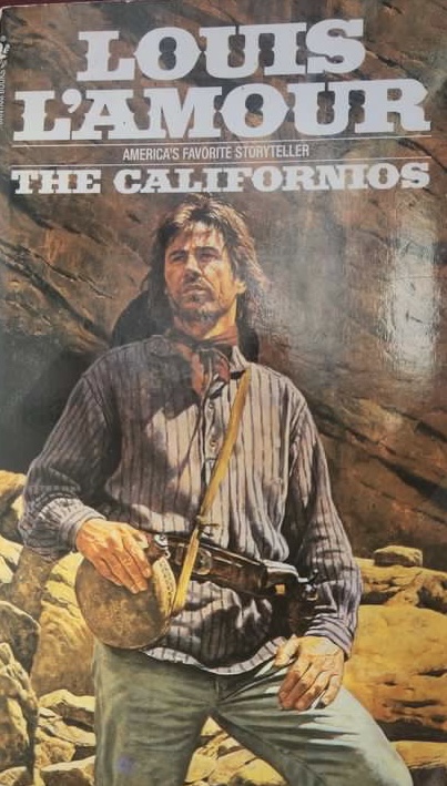
Beth Tondreau | COMD1127—D035 | Fall 2023
For some reason my computer would’nt let me insert the actual picture of the lotion. But I can see Garamond font as the title, ” Jergens”. The brackets on each letter, on the ” G” has the same characteristics.

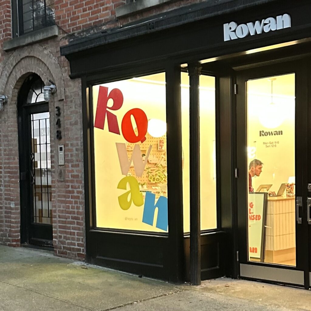
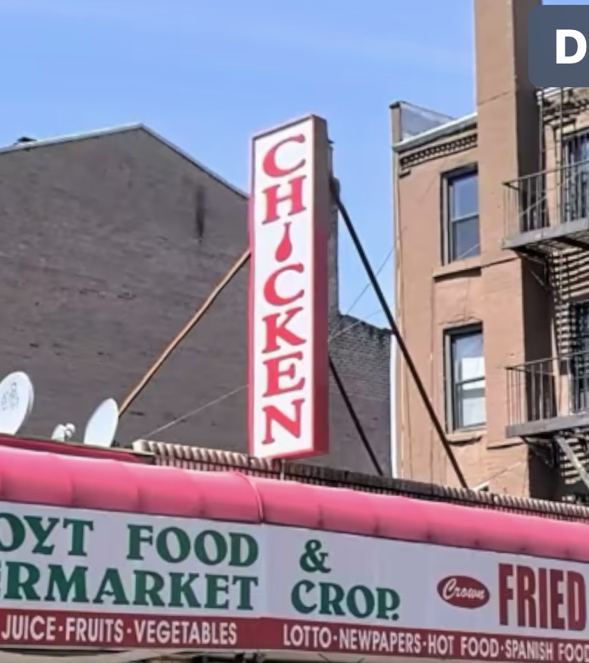
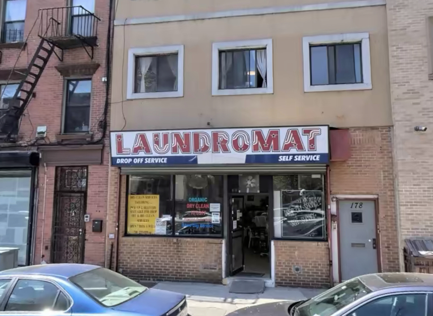
These are the expressive types that I found. The first business’ window graphic looks to be falling lettering. The second business’ vertical sign has a chicken leg as the i in Chicken. The last sign has graphics In the lettering. … Read More
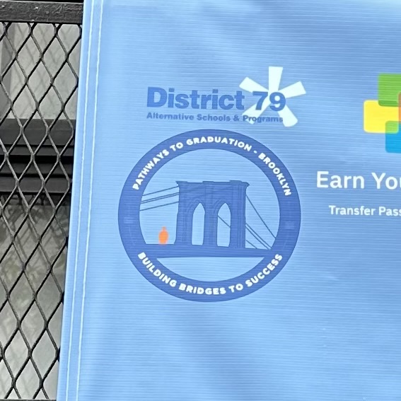
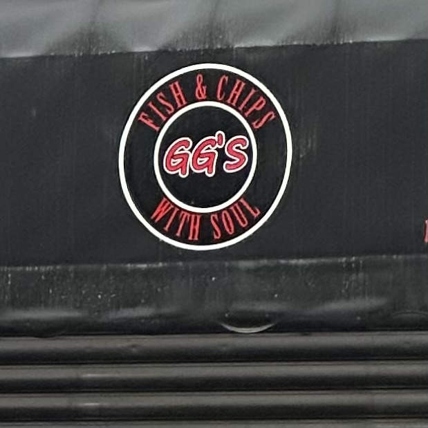
The first two signs have curved type. In the first photo, the type is San serif and it looks to be semibold. The type in the second photo is a light condensed Serif. They both are clear and effective. They … Read More
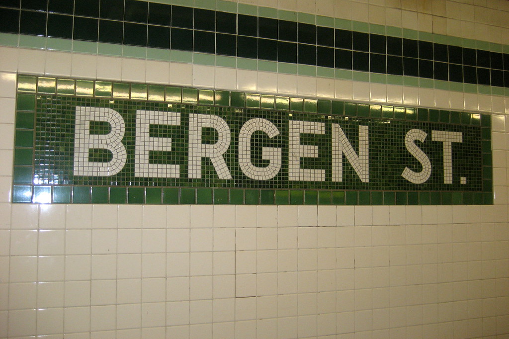
This is Bergen on the G line. The line’s service started in 1933. The type face is San Serif. This station is 90 years old as of last month. It has had many renovations from 2013 to Now.
The Starr street sign. In the Jefferson street station is my favorite train sign. Because it’s where my dad lives. And I love stars so it’s the perfect combination. The sign uses a transitional serif font. We can tell because … Read More
© 2025 COMD1127 D035 Type and Media FALL 2023
Theme by Anders Noren — Up ↑