I like Paula Scher’s work, all The Public Theater covers caught my attention. especially the 3 an 4 pngs. They are very expressive and perfect for the event that she is advertising. love it’s sense of bold and authentic chaos. … Read More
Author: Zacarah King (Page 3 of 6)


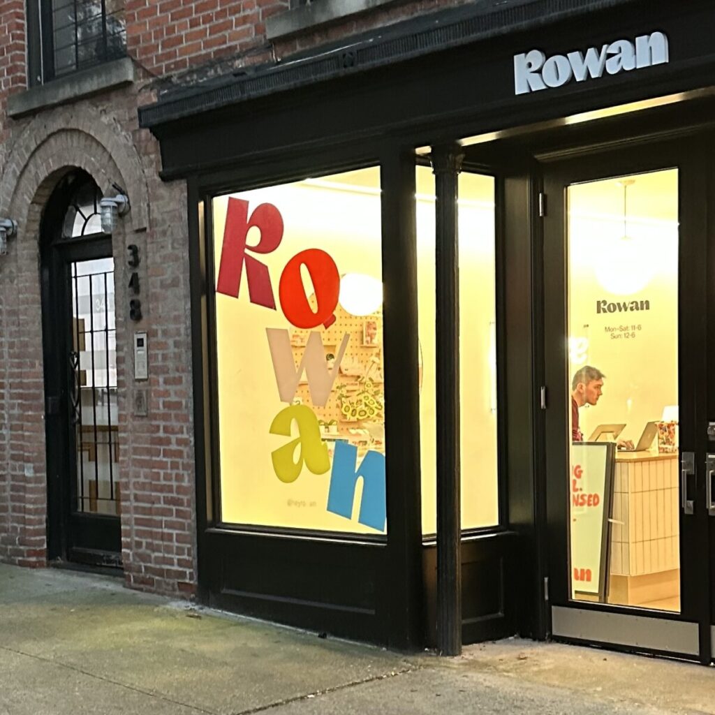
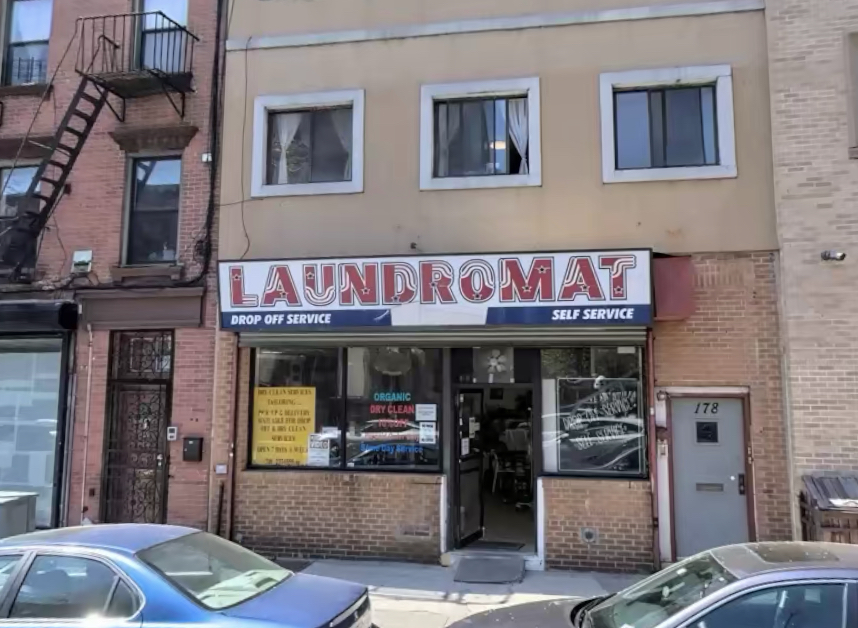
These are the expressive types that I found. The first business’ window graphic looks to be falling lettering. The second business’ vertical sign has a chicken leg as the i in Chicken. The last sign has graphics In the lettering. … Read More
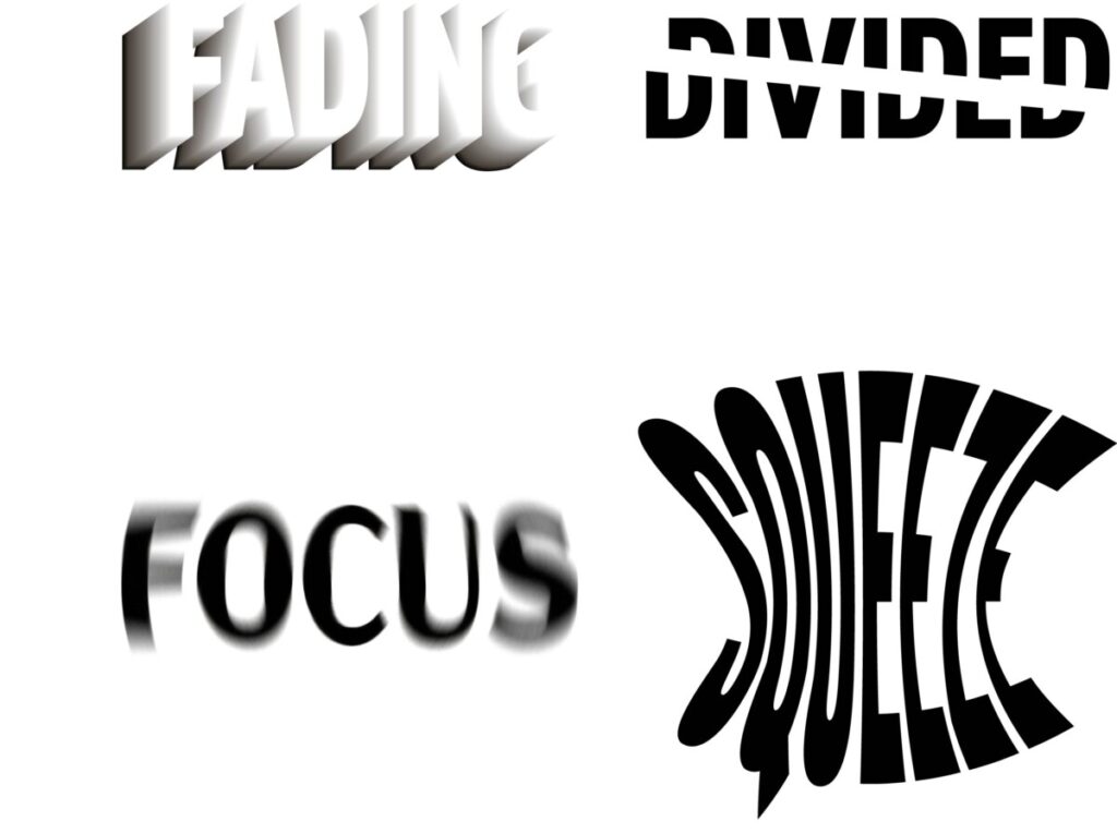
The is a drastic difference that I can see between Courtney Wagasky’s and Timothy Goodman’s perspective of expressive type. Wagasky’s expressive type is strictly just type. it has no color or imagery. It is just the choice of scale and … Read More
Looking at the Emigre catalogue the typefaces that I see are Serif (faintly seen) and San Serif, as well as a handwritten cursive. The left page contains a transitional san serif font, and it is legible. Both paragraphs are very … Read More


