The first poster that attracted my attention was by Julia Hoffmann Fall 2012. When looking through the posters it was the first to use the bold color of red. After reading the description confirmed my inference that the red looked … Read More
Author: Zacarah King (Page 2 of 6)
One of the quotes I found Interesting from Zuzana Licko was from her interview with Rhonda Rubinstein on published in the Eye Magazine. she said “Each design gives me the opportunity to study details of classic faces that I’d … Read More
- The typeface used in Dream in color by Tré Seals is San Serif in Bold. I do appreciate the use of a simple font against the Rainbow Metallic background. However the background contributes more to the subject of the poster
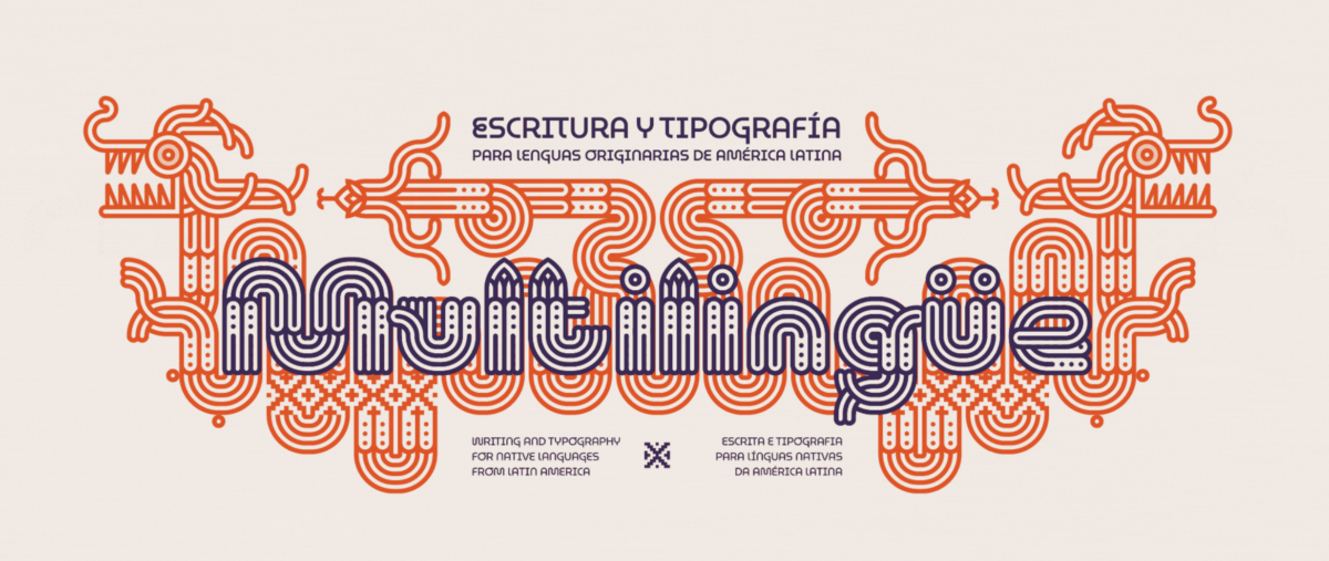
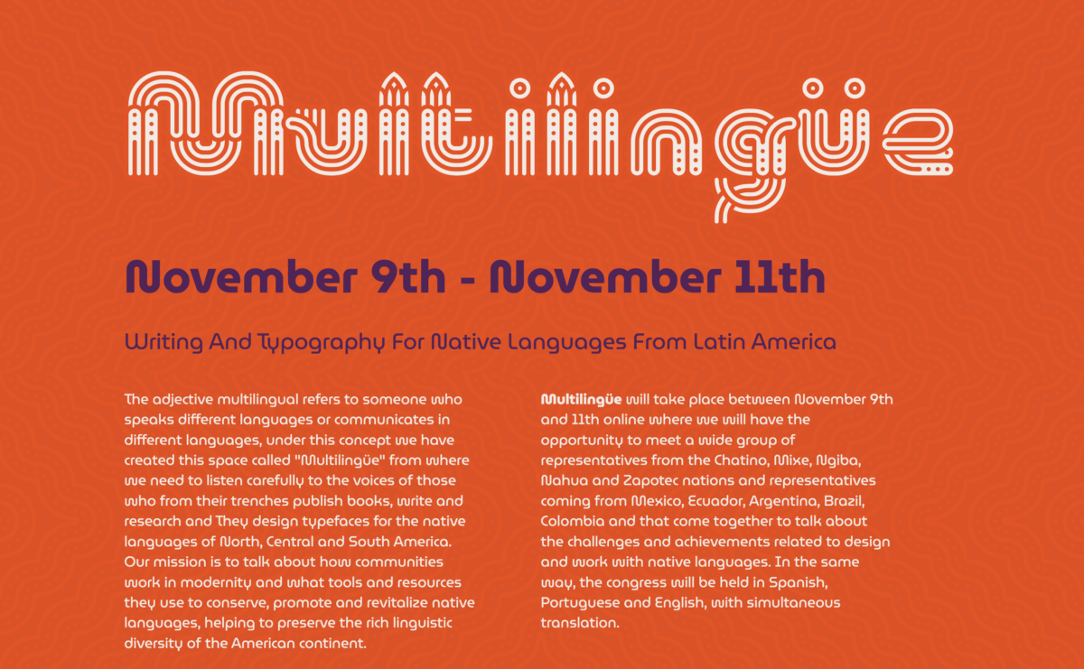
Image Credit: Type Drives Culture; Multilingüe
I appreciate the individuality and uniqueness that is expressed graphic designs and typography. Over all i feel quite neutral. the graphic/ animation wasn’t difficult to read but i definitely didn’t understood what it said … Read More
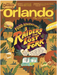
I chose Mary Kate McDevitt. I now have a strong fondness for her work. I admire all of her lettering and illustrations, mainly the Orlando Food Adventures Three. Something that i found successful was the creative personalized design that she … Read More


