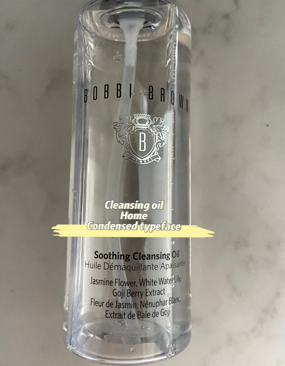
Windsor was first developed in 1905, it was as popular as Helvetica until it was replaced by Helvetica. Windsor is a serif and compared to other typefaces, it is more rounded and thicker. Windsor gives a feeling that it has … Read More
Author: Shiqing Wei (Page 3 of 5)
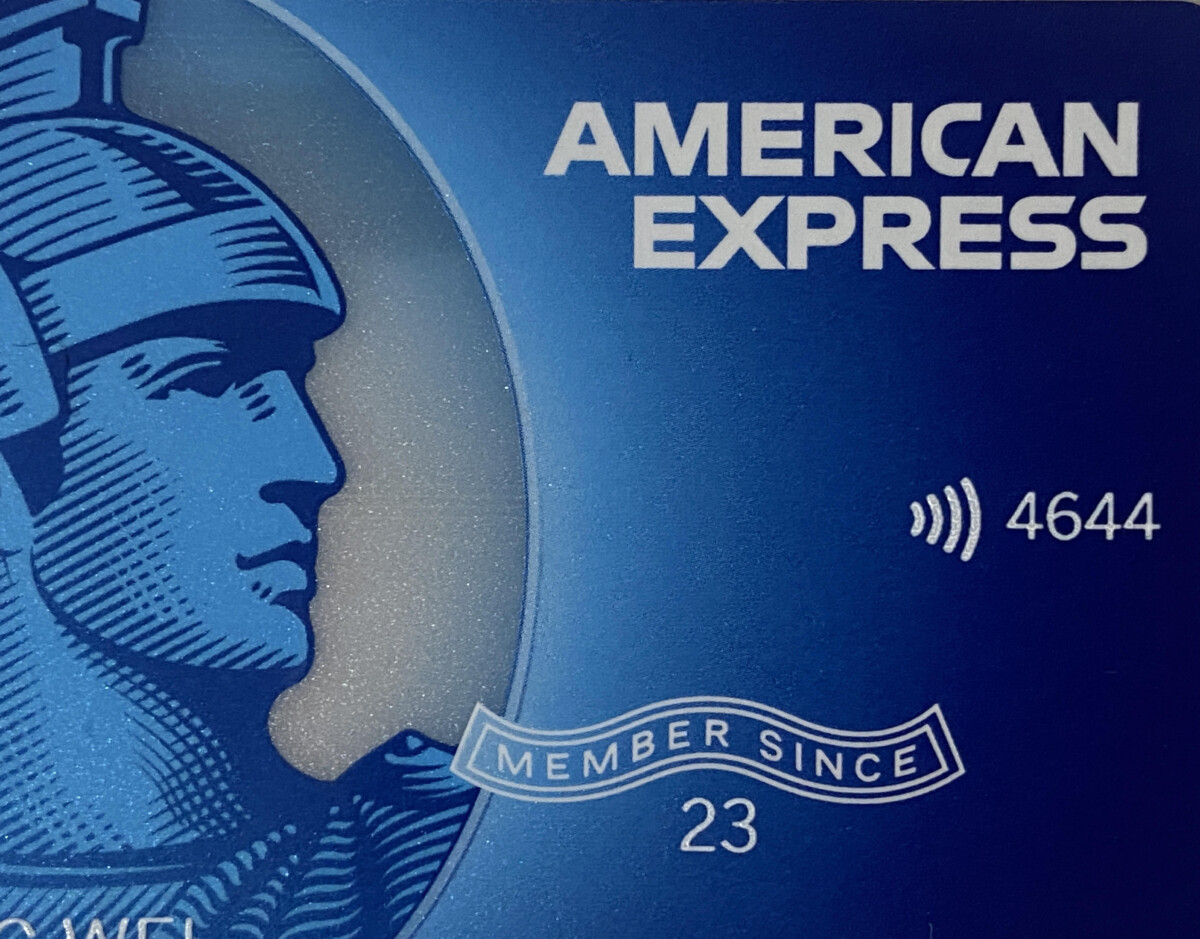
This is a credit card I have and Member Since is on a curve. I found these are the only words that are on a curve in the credit card, I do think this use is successful because it kinds … Read More
I am torn between these book covers because they all caught my attention. Their unique and particular layout of words and letters is distinct from the forms that I usually see. The words are set in a curved path. Its … Read More
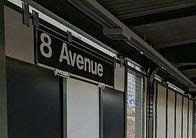
This is 8th Avenue station. This sign is in transitional sans serif. This station was opened in 1915 but was renovated from 2016-2019. This explains why this sign is in a transitional sans serif, it looks more legible and easy … Read More