I found this cosmetics tube that uses vertical type. It was very hard for me to find any items utilizing the type on a path tool. This cosmetic brand “COOLA” uses a vertical sans-serif typeface on all of their products. … Read More
Beth Tondreau | COMD1127—D035 | Fall 2023
I found this cosmetics tube that uses vertical type. It was very hard for me to find any items utilizing the type on a path tool. This cosmetic brand “COOLA” uses a vertical sans-serif typeface on all of their products. … Read More
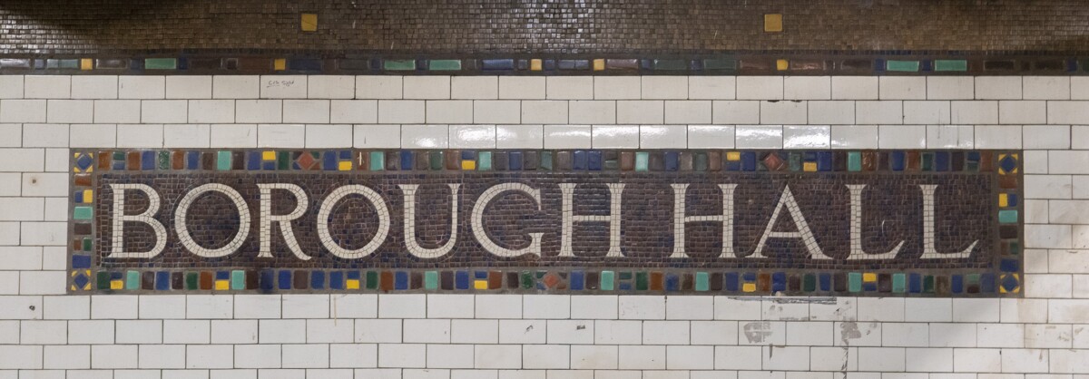
This is one of the Borough Hall Train Station Mosaic Name Tablets. The station was opened on July 1, 1948, and has been updated in the same style for many years after. The typeface is a serif font in all … Read More
The left image is my favorite and most eye-catching. The designer used the type of a path tool in a radial pattern and it draws the viewer’s eye in. Although it is hard to read the actual text due to … Read More
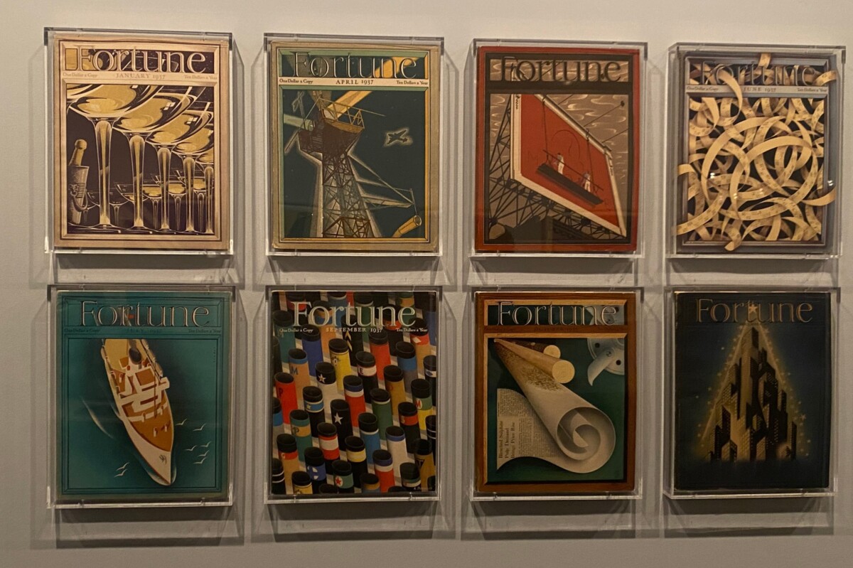
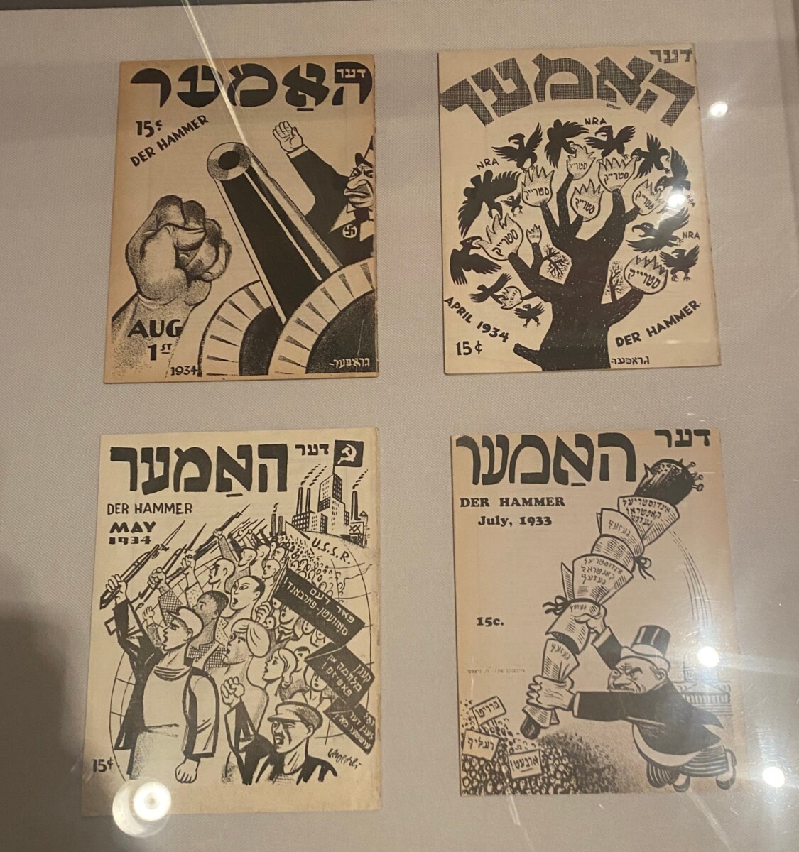
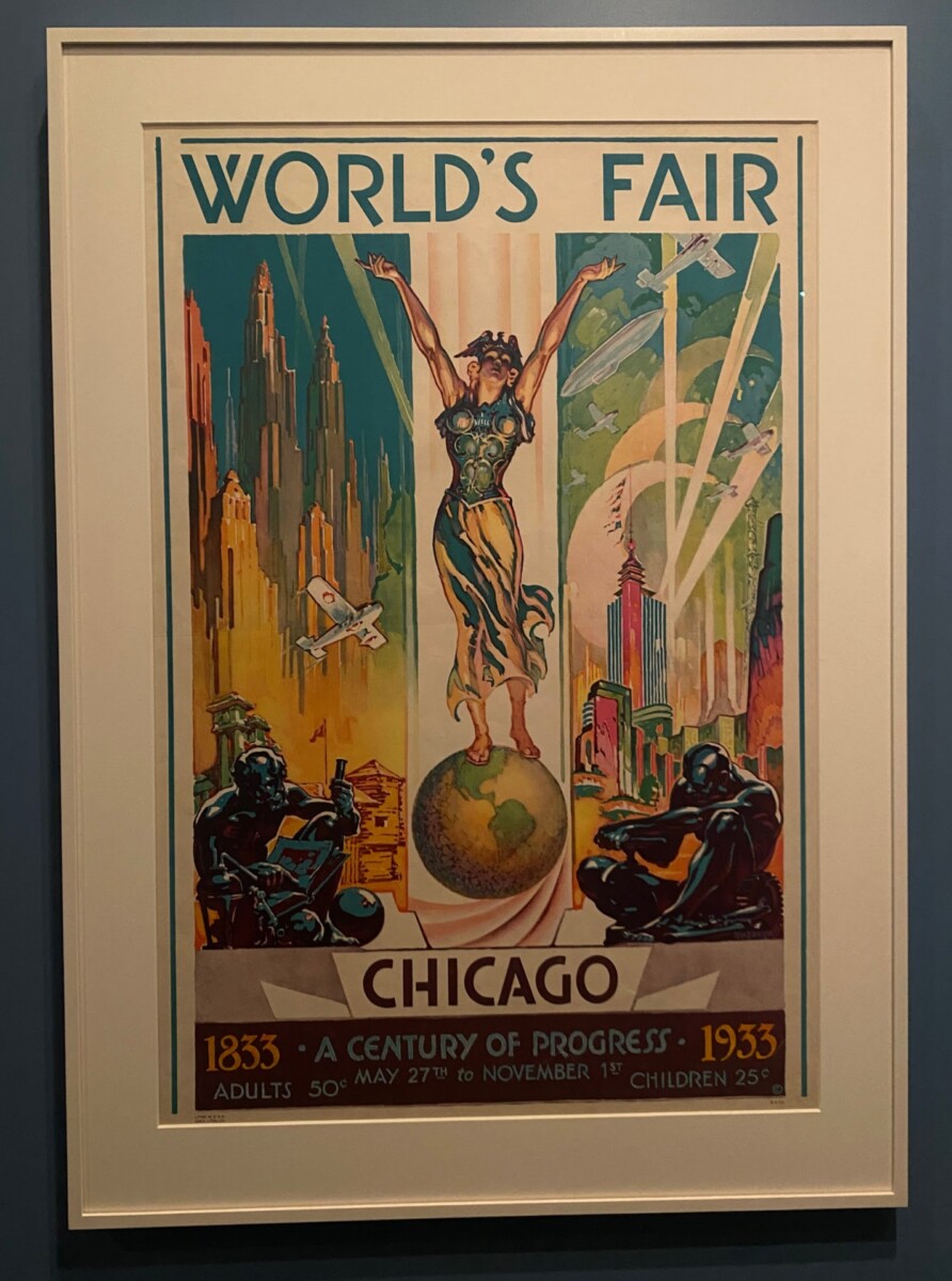
I went to the MET and saw Propaganda posters and Fortune Magazines. I found varying weights in both of the examples.
I know it’s small, but the “to” at the bottom of the poster is in italics. It’s not very … Read More

© 2024 COMD1127 D035 Type and Media FALL 2023
Theme by Anders Noren — Up ↑
The OpenLab is an open-source, digital platform designed to support teaching and learning at City Tech (New York City College of Technology), and to promote student and faculty engagement in the intellectual and social life of the college community.