The first thing I noticed in the book that we’ve also done, is the listing of all the typefaces that were used in the book. They also used type on a path and played with leading. I think the project … Read More
Author: Sarah (Page 2 of 6)

Jessica Walsh Poster
I chose this poster because in the description it said it is a gold material in the background. The shiny material is out of gamut and therefore would look different printed and in its final form. Piscatello … Read More
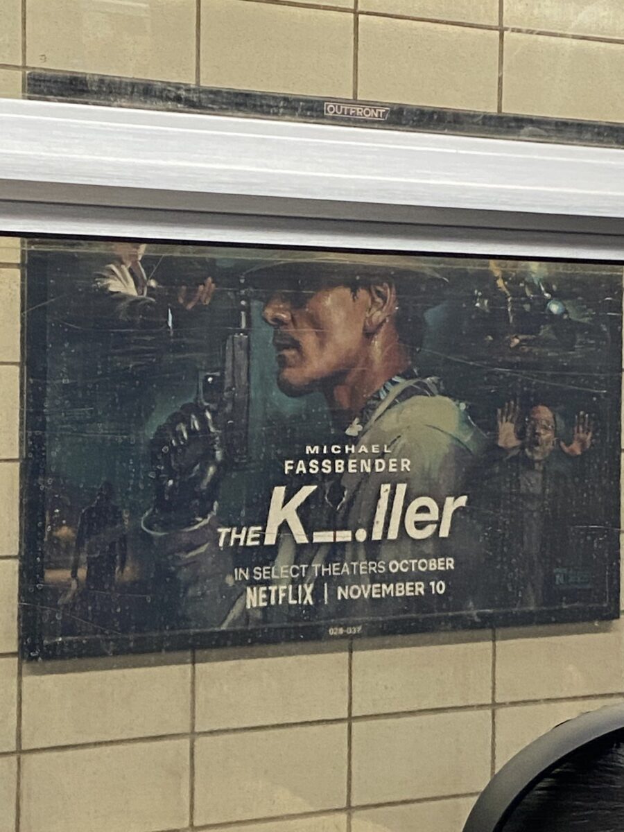
I saw this ad for a tv series and it included morse code which I thought was super fun. More interesting than just having plan sans-serif type on the poster. It also gives a peak into what the show is … Read More
Quote
“It’s not a problem of being a woman in a man’s world. It’s being a type designer in a world that gives little recognition to this art form”
It seems like an obvious choice to choose this quote, but … Read More
Dream In Color: This cover is very successful. The holographic foiled background makes the bold, black, sans-serif font really pop. The foil of the background also draws the viewer’s attention to the word “DREAM” before the other words. The type … Read More


