The one poster that stuck out to me the most is the one that says, “You are worthy of days where you can just be.” I believe that the usage of bold lettering for the type works since it attracts … Read More
Author: mauricio uruchima (Page 1 of 4)
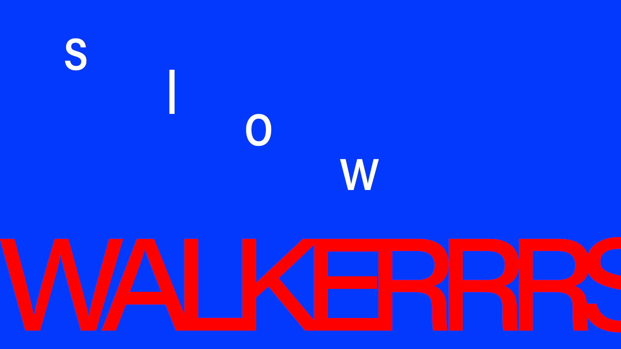

I believe the first animation works for the word “uncomfortable”, while the poster falls short in comparison. In my eyes, the first animation worked better thanks to the words moving around so much. They scatter around uncontrollably as well as … Read More
One poster that stuck out to me is one by James Victore, more specifically the poster that has Anais Nin on it. I personally like this one a lot for a couple of reasons. I believe that the composition of … Read More


