Credit: Type Directors Club
This website is different from others mainly based off the amount of detail they put into it. I found that the layout of the website, it being able to take up the whole screen as i … Read More
Beth Tondreau | COMD1127—D035 | Fall 2023

Credit: Type Directors Club
This website is different from others mainly based off the amount of detail they put into it. I found that the layout of the website, it being able to take up the whole screen as i … Read More
For some reason my computer would’nt let me insert the actual picture of the lotion. But I can see Garamond font as the title, ” Jergens”. The brackets on each letter, on the ” G” has the same characteristics.


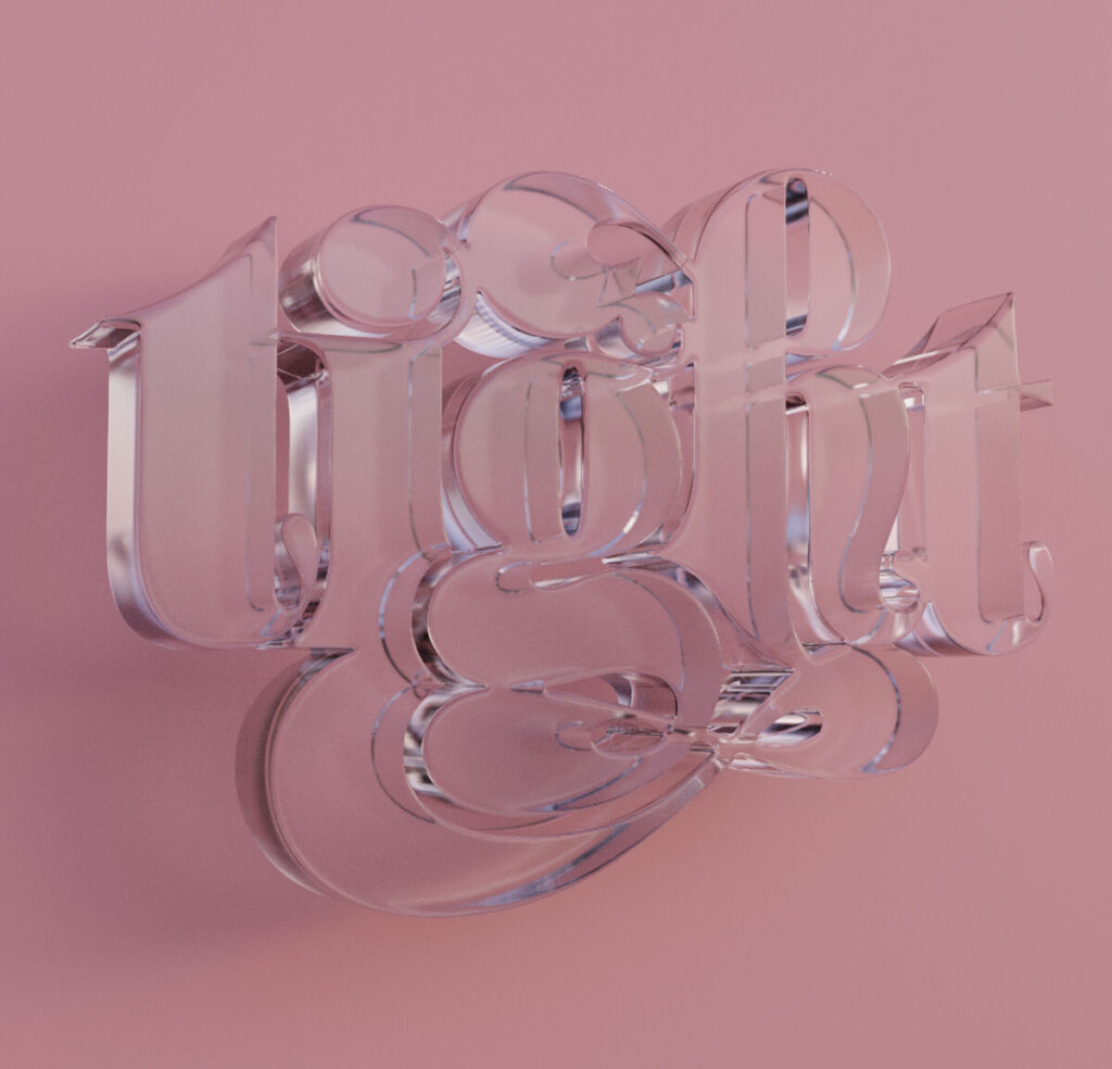
I chose a piece from Jessica Hische named ” tight”. I find the overall message to be successful, even tho she was just kind of “messing around” its still fun and interactive to see. I can see a repetitive style … Read More
© 2025 COMD1127 D035 Type and Media FALL 2023
Theme by Anders Noren — Up ↑