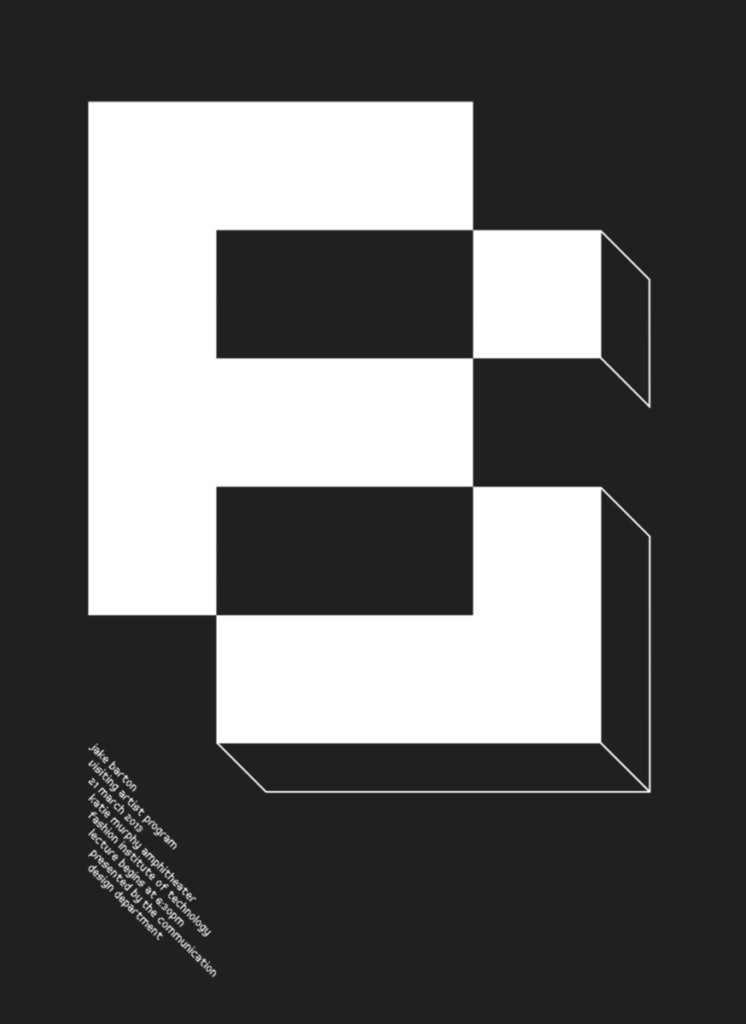
The three posters I chose were named Eso Tolson, Mina Elise, Hunter Saxony III. I feel as though all of these posters speak to my interest as though they’re all just different in their own ways. The one I like … Read More
Author: Marsenan (Page 1 of 5)
Grids, making up amny grids can lead to a more organized layout. Having many rows and columns could give you a wider layout, more nice black space that could surround your layout.
Hierarchy, ” keep it crunchy, don’t overdo your … Read More

I chose this poster to talk about because I feel its more on the playful side. Looking at it at first I liked the cubic lettering. Then when I read the description they spoke about there being a letter ” … Read More
Zuzuna Licko and her husband was able to work together create a successful company that had started many innovated movements for graphic design. They as a group exposing the new foundation for graphic design the came to the creation of … Read More
” Dream In color” I can feel its a bold type and has a san serif type face. Even though in the article he says he created the font himself, it has the look of bold type. Reading his website … Read More


