I choose “Jessica Walsh” “W” because is one of the many few that has more then one color i like the gold background and the little fold on the corner that forms the “J” I think its very clever its … Read More
Author: Keylin mella (Page 1 of 2)
The type in the catalog is called Windsor, I don’t believe I’m a big fan of this type because I don’t like the tilts in the letters and how thick the ends are I think it is too playful personally … Read More
I like the intriguing design and the use of opacity on dark backgrounds as well as the condensed fonts I feel create a visually interesting aesthetic. I also see some forced justification, where the text is aligned evenly on both … Read More

Bold/condenced?

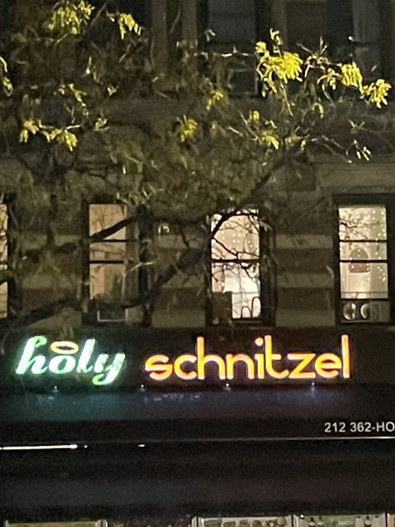
Kinda italic on “holy”

I wouldn’t say condensed but definitely a different line weight… Read More


