The cover that caught my attention is “fernando gandra” in all caps. The design of the text it feels like it is going to explode. When it is all caps it catches my attention because it seems interesting that this … Read More
Author: Justin Tarigan (Page 3 of 4)
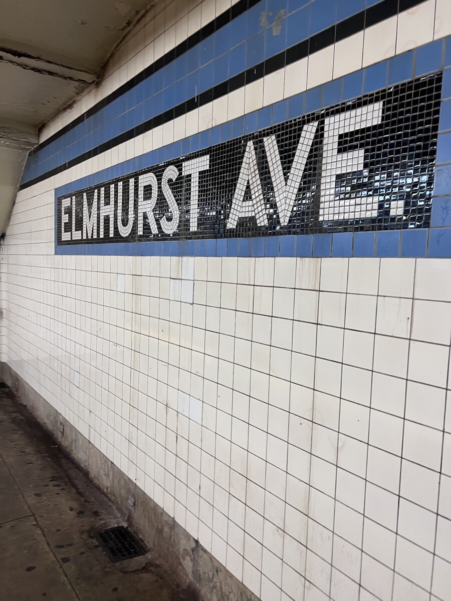
Elmhurst Avenue in Queens. This classification is San Serif. This station was built on the IND Queens Boulevard Line as a local station. This signage was built along a section of the line with the same classification typeface when construction … Read More
Photo 01: I think this signage is convey to the jewelry. The typeface is slab serif and slab serif does not have brackets to them. What makes me think that convey is the color of the typeface is light blue. … Read More