in dropbox… Read More
Author: Justin Tarigan (Page 2 of 4)
From MikeNicholls_04 in Mike Nicholls Type Culture. I noticed a few things. I see is a san serif font is being used. “A Life In Hip-Hop” with a “damaged” text on the typeface. The theme for the background is orange … Read More
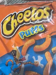
“Cheetos” snack logo has an expressive typography. The typography looks like as a cheetah animal resembling the mascot of the snack. The colors of the cheetah makes the snack brand “Cheetos”.… Read More
Windsor typeface was used the New York City Subway until the 80’s when it was switched to Helvetica. Windsor is mostly getting replaced because it was good and inoffensive before the 80’s because of industrialization. Which most companies start to … Read More
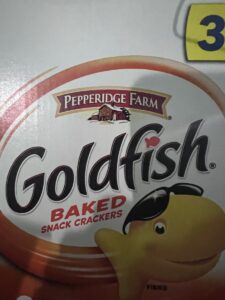
Pepperidge Farm, The company brand that produce Goldfish snacks has a curvy logo. It is an arch logo which I think it is a unique thing to put because they have a logo image underneath the text which you … Read More


