This is hard to choose, but I rather go with poster 2 and 3 because it is simple and basic. Although despite it is saying “Dream in Color” because it does not feel clear and the colors are mixed which … Read More
Author: Justin Tarigan (Page 1 of 4)
Paul Sahre’s project is about an album of a book for the Giants. It is an album that is a physical book of lyrics and photography. Sahre’s projects were for bands but soon abandons his projects when he does his … Read More
I chose Marshall Arisman/Scott Stowell poster. One reason why I chose this poster is because it uses a Sans Serif font and the typography is looks like Helvetica. The design of this poster have a typography which the words are … Read More
Zuzana Licko created the LoRes font. I think Licko has been an awarded a few times. In 2013 she recieved a Typography award by the Society of Typographic Aficionados.
This pixel typeface reminds me of any retro video games … Read More
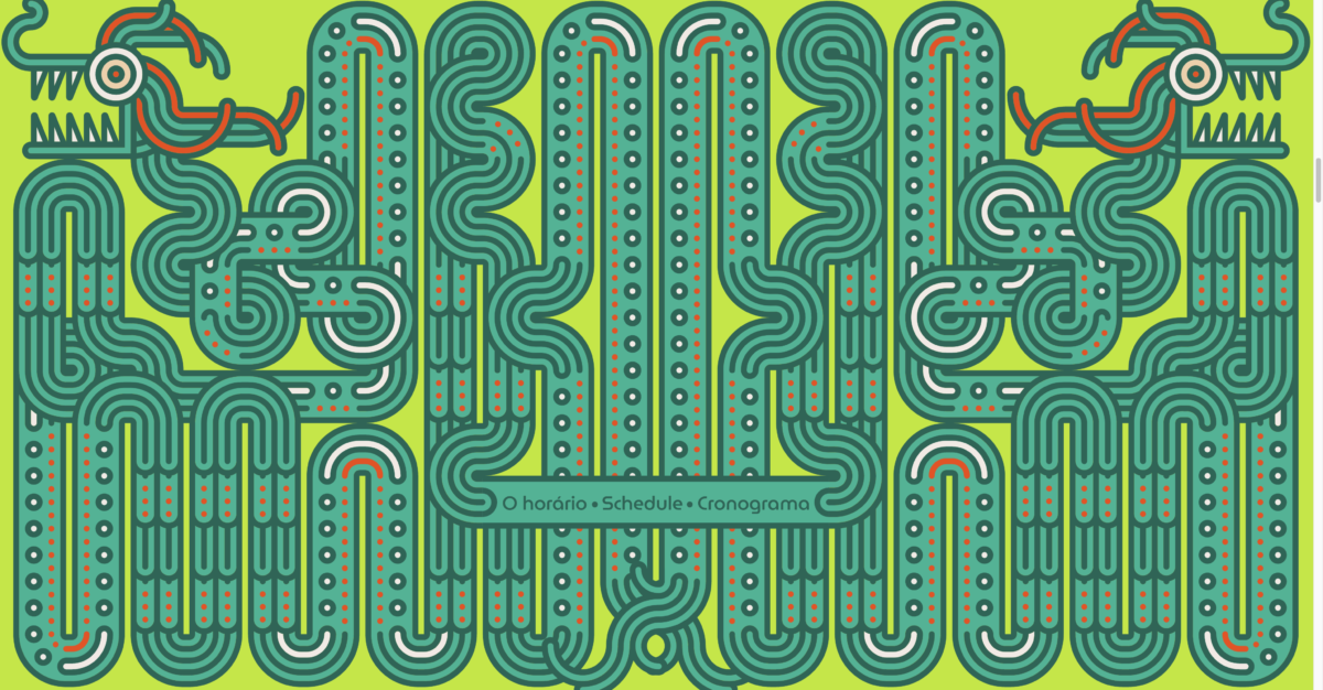
I think this is the most interesting page for me. This is the schedule page, there are dragons on the background page with a small banner with the schedule on the bottom middle. I think this is a good design … Read More


