The first thing I thought about was our first project, The Typebook. We did similar things such as type of a path (shown in the third and seventh image in the article). It also challenges the legibility lessons we’ve been … Read More
Author: Julissa.A (Page 2 of 7)

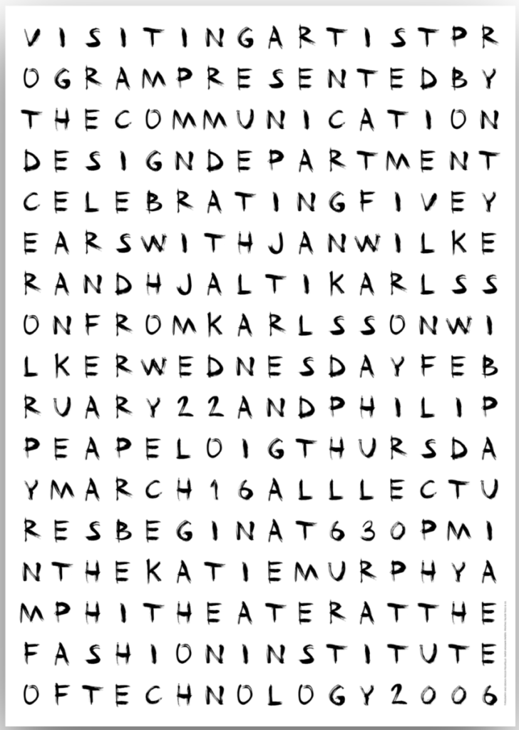
The main reason I chose this type was because of how cryptic it looks and how much it reminded me of some cryptic letters a serial killer sends to the police station to mess with them-
Aside from the creepy … Read More

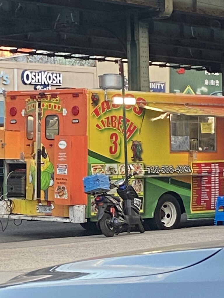
This taco food truck has a very fun appearance, as most food trucks do. The type is a warped sans-serif with a shadow behind it to give it depth. I think it’s successful in getting the job done.

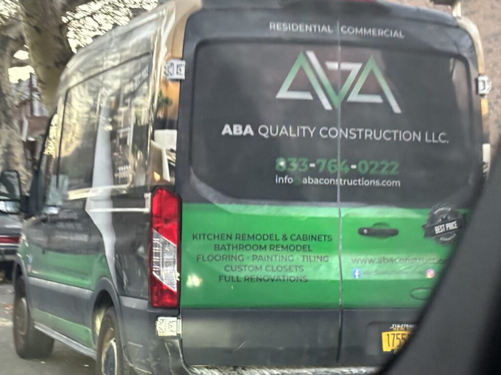
Sorry for … Read More

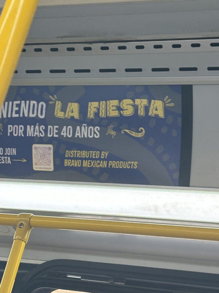
Though you can’t see all of it, the whole advertisement was for tortilla chips. The type for “LA FIESTA” is supposed to look like tortilla chips.… Read More
This might be unrelated, but Zuzana Licko seems like a fun person. I say this because I think in order to make a fun font like Licko did, you’d have to be a fun person. Also, she looks very sweet … Read More


