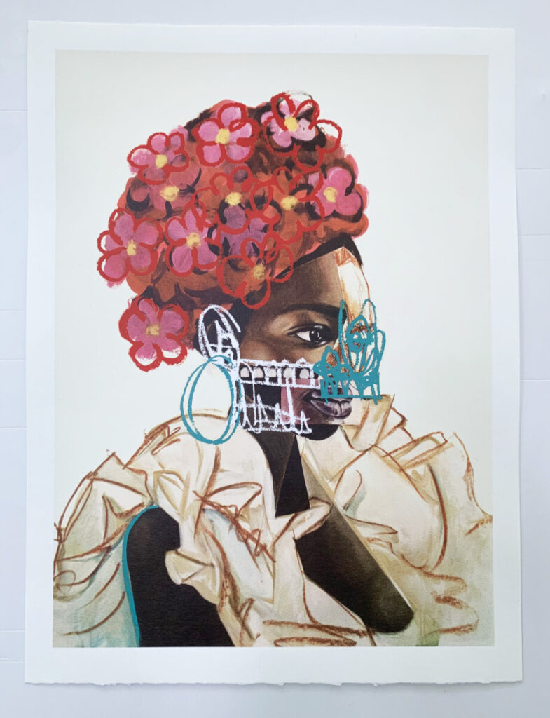
The first poster I chose is by Malik Roberts. He is a multimedia painter that works with images that associate with the media. I like really like this poster because of the multiple mediums he used to make it. Roberts … Read More
Beth Tondreau | COMD1127—D035 | Fall 2023

The first poster I chose is by Malik Roberts. He is a multimedia painter that works with images that associate with the media. I like really like this poster because of the multiple mediums he used to make it. Roberts … Read More
The first poster has animation for the word “uncomfortable” where the letters are constantly moving around. I think this portrays the word successfully since it is uncomfortable or even frustrating to read the word while the letters are flying everywhere.… Read More
I chose James Victore. Their work looks really cool and punk-like. The hand written letters makes it feel organic and comedic since most of the images they use are real. The real images and messy handwritten letters make for a … Read More
Ellen Lupton, reminds me of our dear Professor Beth!
Anywho, her explanation for grids, hierarchy, and type size is very simple but precise.
For grids, I like how she explains the wide variety of grids and how they can be … Read More
© 2024 COMD1127 D035 Type and Media FALL 2023
Theme by Anders Noren — Up ↑