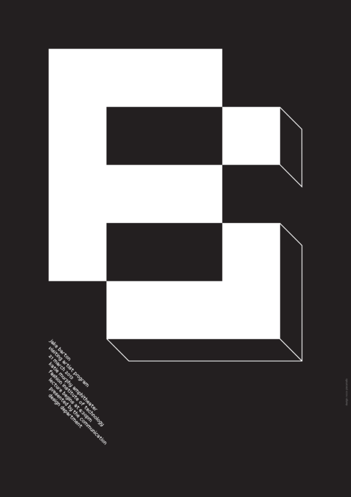
I choose to talk about Piscatello’s poster for Jake Barton. Because i thought it was a very fun and unique way to show his initials. He uses a bold sans serif font and adds 3 dimintality to the type by … Read More
Beth Tondreau | COMD1127—D035 | Fall 2023

I choose to talk about Piscatello’s poster for Jake Barton. Because i thought it was a very fun and unique way to show his initials. He uses a bold sans serif font and adds 3 dimintality to the type by … Read More
Dream in color uses a bold, all cap, sans serif typeface at 2 different sizes to convey its title. And i think it works for what it is the legibility is great w/ the rainbow bg drawing u in but … Read More

(Type Directors Club)
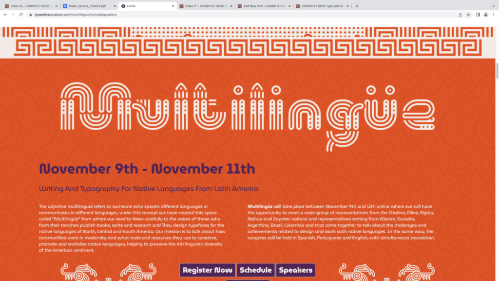
While i like the commitment to the theme i find it hard to read. Due to all the extra lines and curves they add onto the title. but at least the high contrast tells us exactly what … Read More
photo in dropbox… Read More

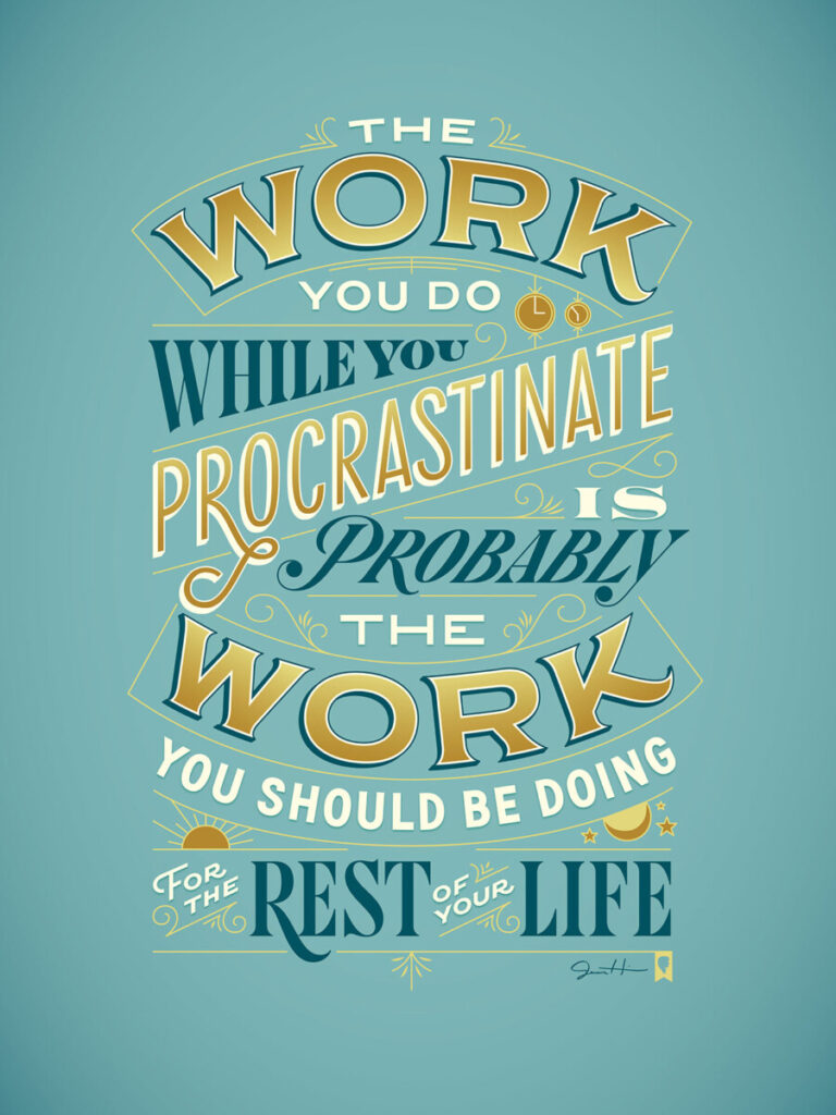
i Decided to feature Procrastiworking Poster by Jessica Hische. I really like the quote and colors of this peace. I love bright colors and bold fonts. Though I personally love it i think i would have to give it a … Read More
© 2025 COMD1127 D035 Type and Media FALL 2023
Theme by Anders Noren — Up ↑