my favorite posters were
black is beautiful by huston wilson
in which i loved the decision to use outlines instead of flat color for the 3d effect i think it makes it fun and colorful without being to much and … Read More
Beth Tondreau | COMD1127—D035 | Fall 2023
my favorite posters were
black is beautiful by huston wilson
in which i loved the decision to use outlines instead of flat color for the 3d effect i think it makes it fun and colorful without being to much and … Read More
i chose to focus on this work
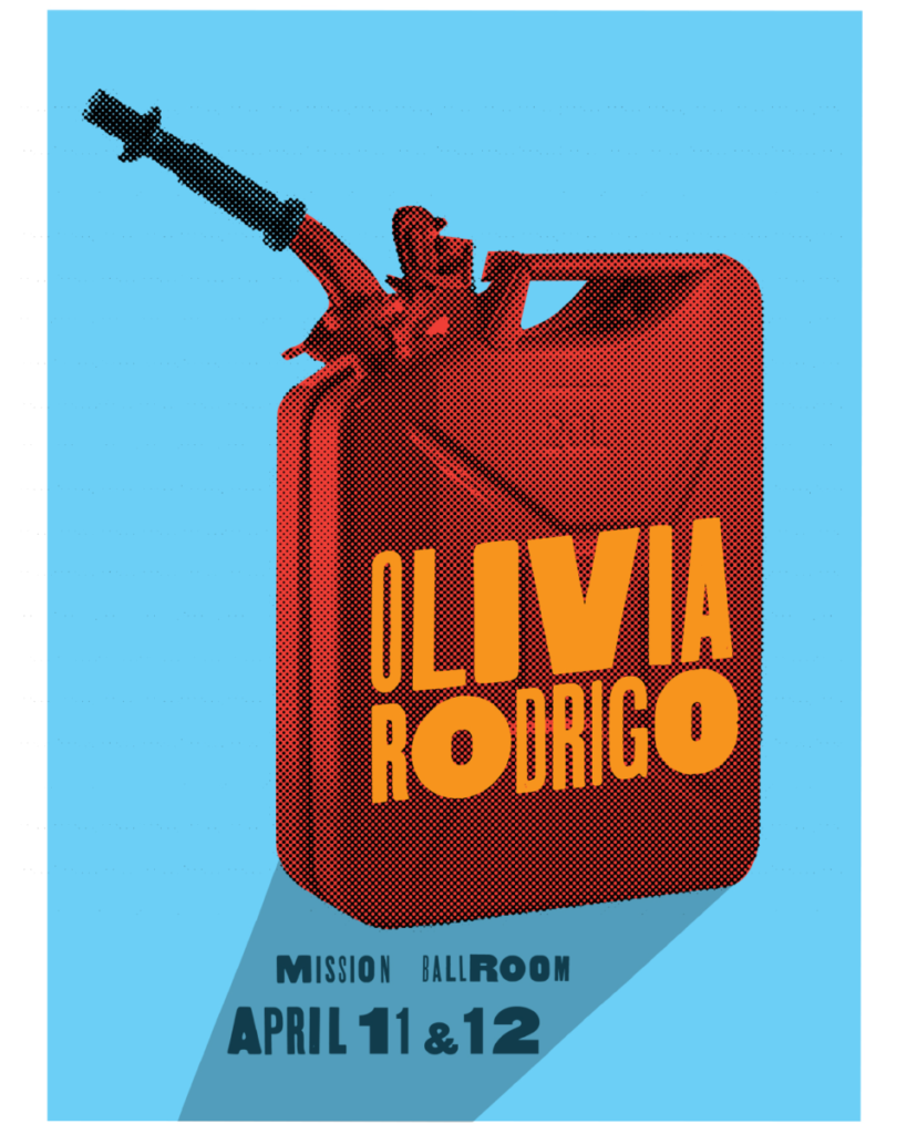
by Rick Griffith and Debra Johnson. I really liked how they uses the shadow to sort of Sudably point to the important information. I also enjoyed there use of color and ho … Read More
Leave some room to breathe! Use grids to create structured white space.
If your type feels mushy, you may have too many sizes and styles. /Many designs taste best with three sizes: small, medium, and large.
The word “headline” suggests … Read More
things tht remined me of what weve done in class wold be his type on a path
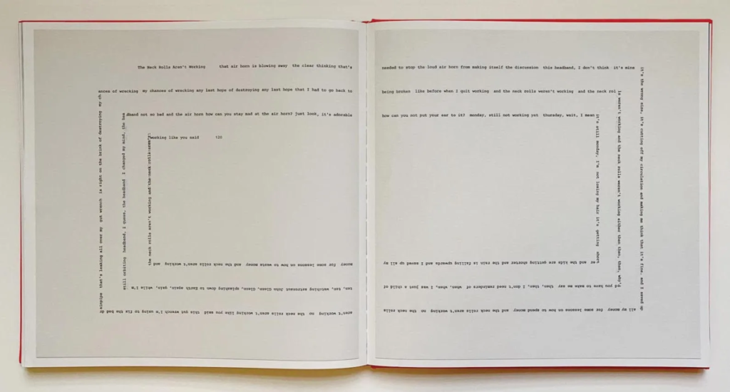
And his use of leading
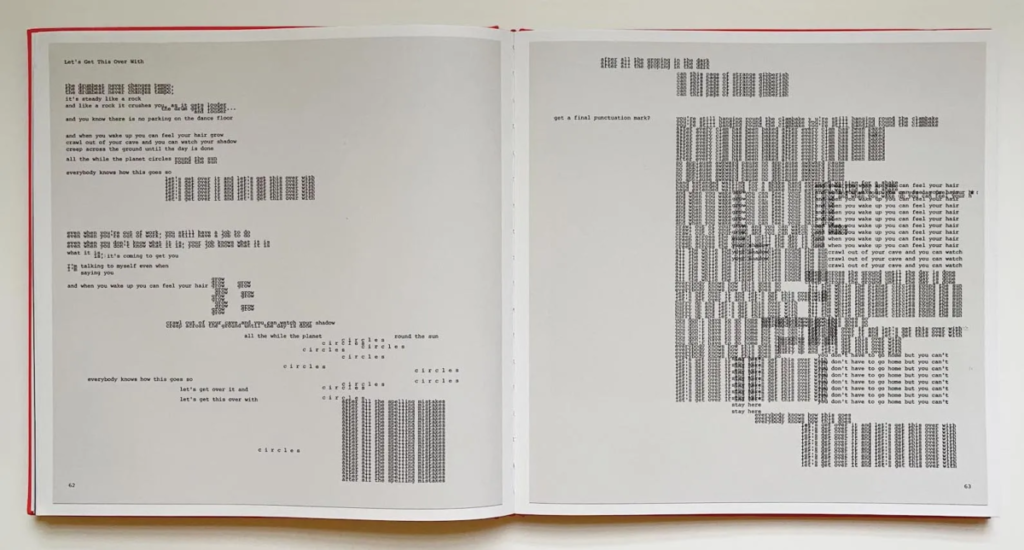
i think its an amazing project and would love to get one of the books my self i … Read More
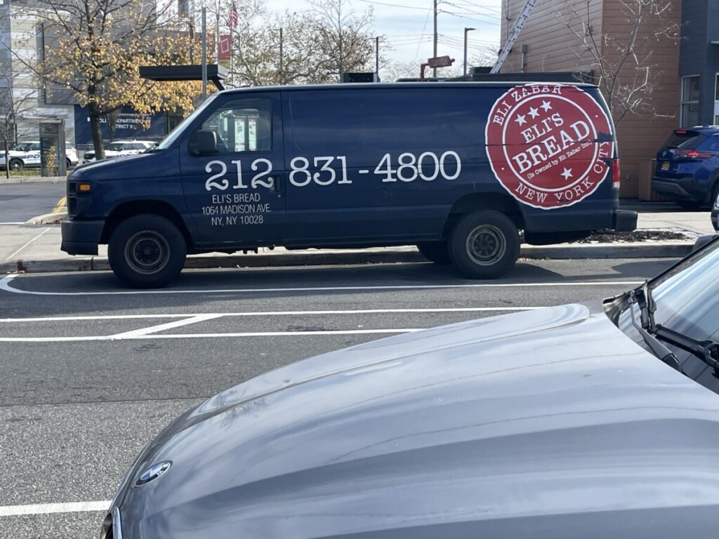

for the brea one i think the font could use some work especially on the numbers its just giving like first font we say type look you know? But i like the red logo it reminds me of like a … Read More
© 2024 COMD1127 D035 Type and Media FALL 2023
Theme by Anders Noren — Up ↑