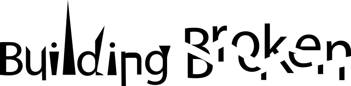
Paula Scher’s work intrigued me the most. Her work seems bold and there tends to always be a main subject thats centered in the majority of her work which really brought my attention.
While looking at her work, one in … Read More
Beth Tondreau | COMD1127—D035 | Fall 2023
Paula Scher’s work intrigued me the most. Her work seems bold and there tends to always be a main subject thats centered in the majority of her work which really brought my attention.
While looking at her work, one in … Read More
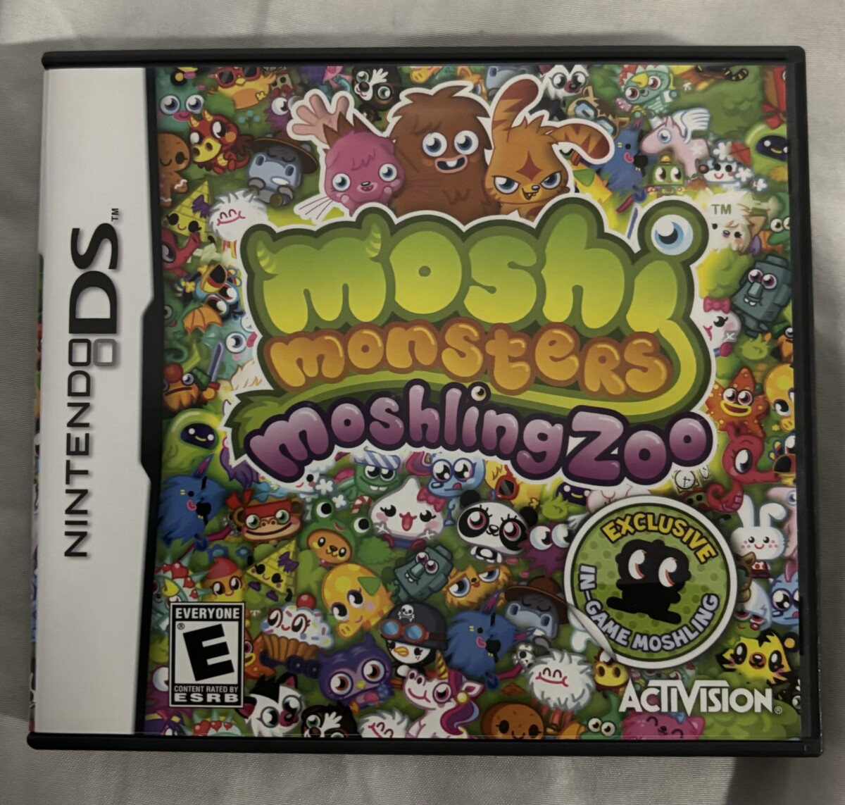
I believe this game displays Expressive type. Being that the game is about “monsters” the type contains “monster like” features, which honestly i find very clue. We see little horns on the M and eye balls on the i as … Read More
All 3 creators differ with their variation is use of expressive type through their creativity and illustrations as well as typeface appearance.
When looking at Courtney’s work in contrast to Timothy and Alexa, its a more clean and direct feel. … Read More
Upon looking at the Emigre, I immediately had to squint. The font seems quite small and looks a bit condensed, perhaps the effect of small fonts/weight. When it comes to the typefaces, it seems like it ranges and contains all … Read More

© 2024 COMD1127 D035 Type and Media FALL 2023
Theme by Anders Noren — Up ↑
The OpenLab is an open-source, digital platform designed to support teaching and learning at City Tech (New York City College of Technology), and to promote student and faculty engagement in the intellectual and social life of the college community.