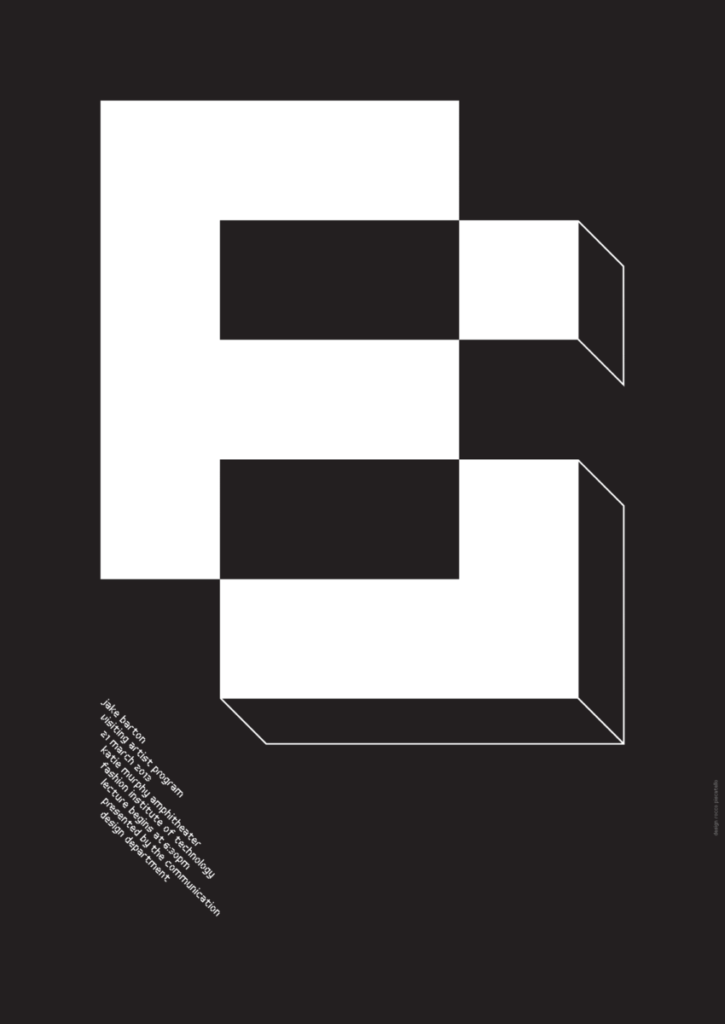
I choose to talk about Piscatello’s poster for Jake Barton. Because i thought it was a very fun and unique way to show his initials. He uses a bold sans serif font and adds 3 dimintality to the type by using outlines on the backside of the j sort of like how a graffiti artist might. i also found it interesting how he uses the space having the b and j only take up 2/3s of the page instead of the whole page so that he had room to put the poster info in at the bottom. And while it causes a top heavy design i think it works to not only bring your eye up to see the typography but also makes you look down to search the almost empty space to see what might be there causing you to find the info at the bottom.


Leave a Reply