Throughout the whole website, it looks as if they are using a modern transitional sans serif. Specifically, it looks as if they’re using something similar to the Futura font but not that one exactly. There is also a lot of bright colors that show up throughout the page. For example, there is a page that changes from orange and purple towards to a green and dark teal color(Im not 100% if it’s actually dark teal). What held my attention the most was this page right here, I like how the dragon was designed. Along with that, I like how the Type Directors Club used different patterns to create this.
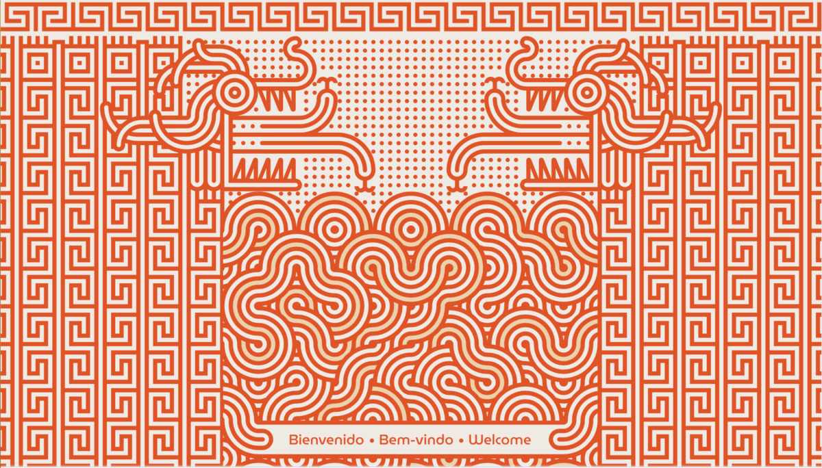
Image from: Type Directors Club


Leave a Reply