(Type Directors Club)
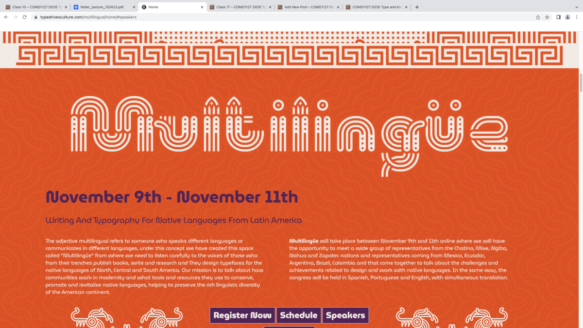
While i like the commitment to the theme i find it hard to read. Due to all the extra lines and curves they add onto the title. but at least the high contrast tells us exactly what we should be looking at. i think also the fact that the word is made up makes it harder for my brain to recognize the type as a word or even as letters.


Leave a Reply