Image Credit: Type Directors Club
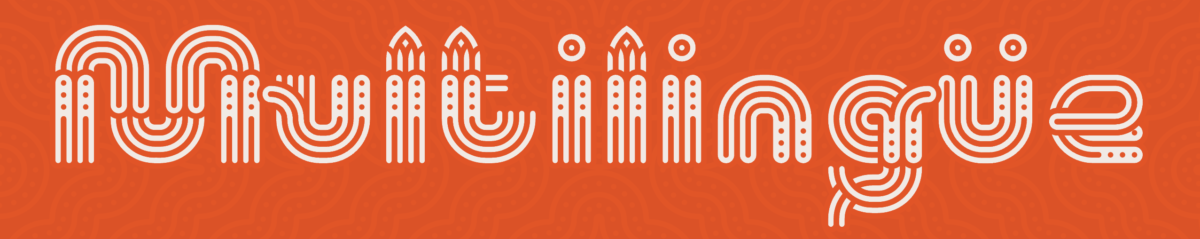
With all honesty, I really don’t know what to feel of the site. I think there is too much going on. Color wise and even typographically. My eyes immediately head to things that are displayed like the image above and not in a good way because, my head hurts now. Also when I scrolled down to the pictures of the people, it was just an “Oh my god” moment. The colors on the people are quite a selection and the lighting makes half or so of their facial features disappear. Reminding me of pop art based on its color palette. When it came to the font being used on the site, i found it actually really interesting. I recall seeing it somewhere, but unsure. It is definitely and interesting choice but im not amused (yeah im picky, I know). Now, the image above, this stood out to me based on the fact that when it was on the site, i was producing headache but now as an image, it hurts less. I do like how abstract it looks and the little designs on each letter, like those designs found in old traditional art from years ago. I feel like it does give it personality, but with such vibrancy and so many patterns, I don’t feel it being very successful.


Leave a Reply