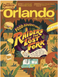
I chose Mary Kate McDevitt. I now have a strong fondness for her work. I admire all of her lettering and illustrations, mainly the Orlando Food Adventures Three. Something that i found successful was the creative personalized design that she recycled from the raiders movie title and its lettering. It is similar but not exactly that same and is unique and true to her art style. What i find appealing about her work over all is the use of hierarchy. She has a flood of Amazing illustrations that are 2 dimensional and delicate and precise. While her type is bold and 3 dimensional. The type is the main focus in the mist of all the illustrations.


I’m glad you pointed out the hierarchy. There’s a lot going on but the content is not hard to navigate.