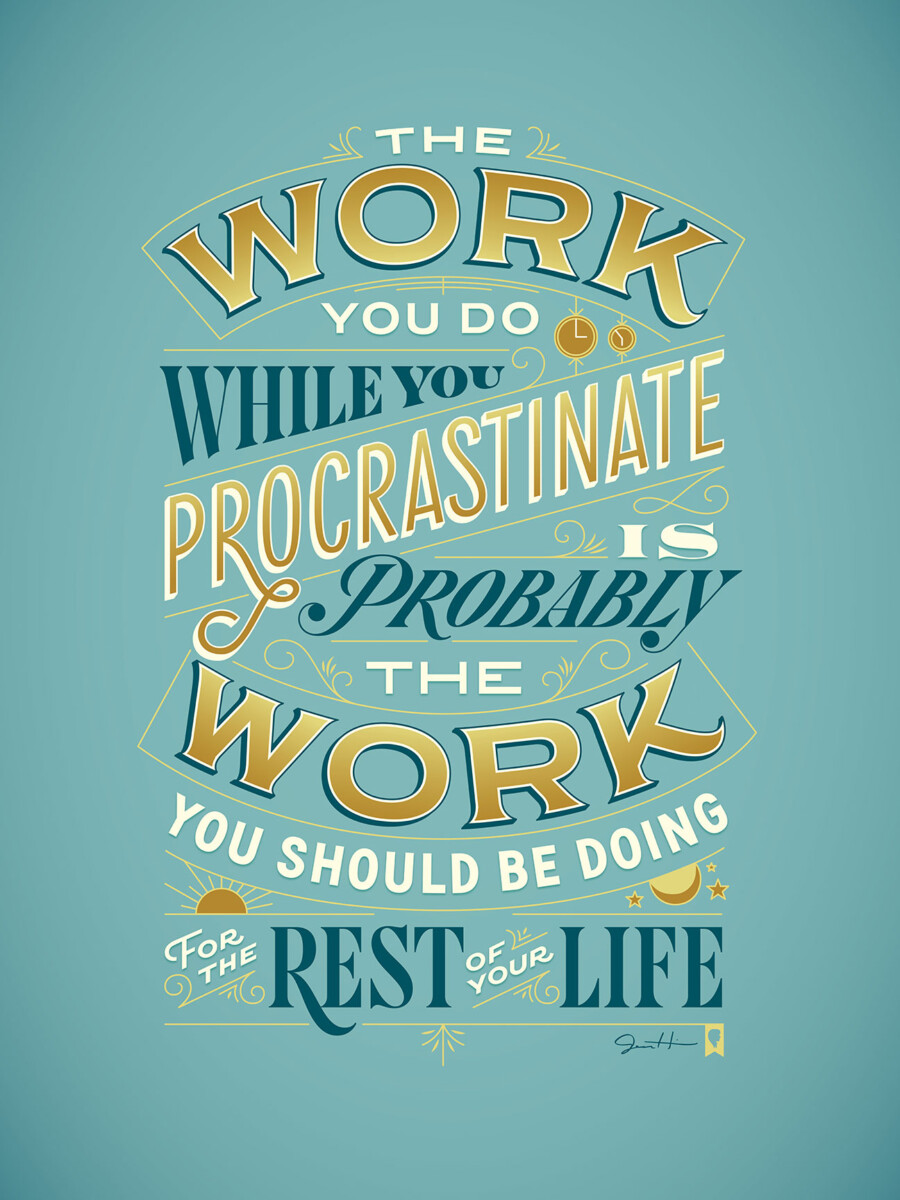
i Decided to feature Procrastiworking Poster by Jessica Hische. I really like the quote and colors of this peace. I love bright colors and bold fonts. Though I personally love it i think i would have to give it a 8 or 9 out of 10 on readability because i find myself skipping over the white words as i read making the poster hard to understand. Possibly because of ll the fonts and angled words it can be hard to decipher what the poster is trying to say


I see what you mean about the white type, although they don’t seem problematic to me. The key words are big and clear by design. Great quote! I agree.