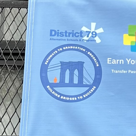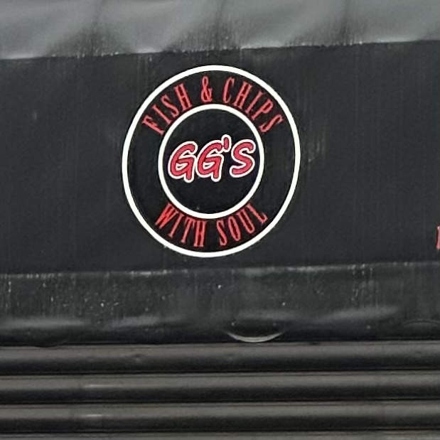

The first two signs have curved type. In the first photo, the type is San serif and it looks to be semibold. The type in the second photo is a light condensed Serif. They both are clear and effective. They don’t take a lot of ocular exertion, they are easy to read.


Leave a Reply