The cover that caught my attention is the one that says “potlatch” in all caps. I believe the artist used a modern sans serif for all the covers. This specific one however drew my eyes towards it the most due to the fact that it’s all tilted. All the words within the page are tilted at an angle, as if it’s going down a hill. It seems that towards the bottom of the cover, they repeat the same word “potlatch” over and over. Along with this they are spaced very close together.
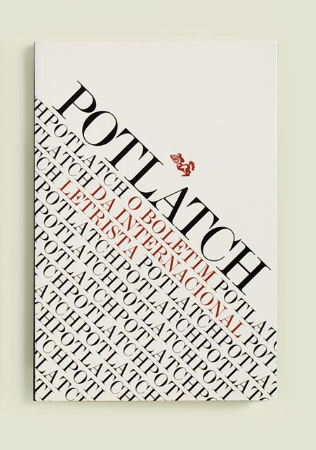


You are correct. The typeface is Modern.
The dense tilted type you describe so well contrasts successfully with the white space at top.