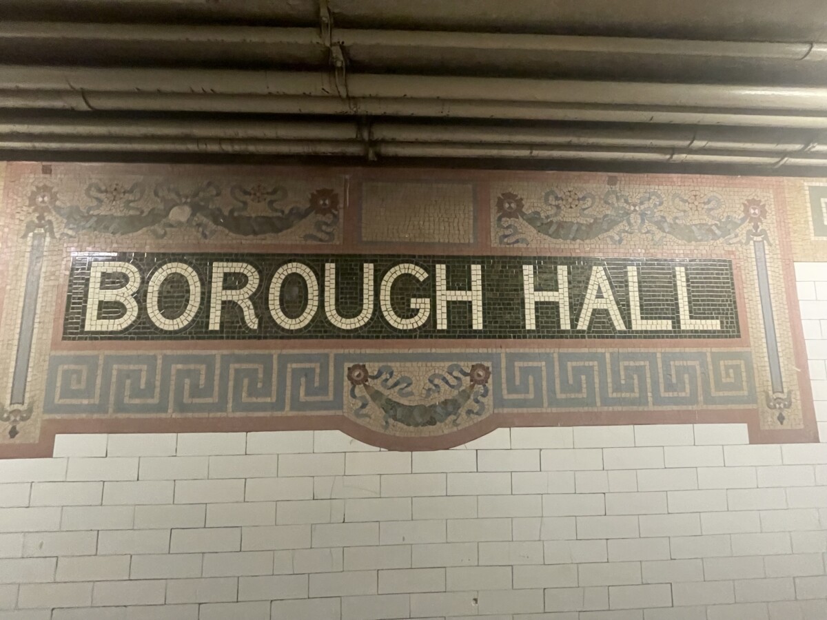
I never seen this station until today. It caught my attention based on the fact that there was two designs for this station. In the first image, we see the station is clearly “Borough Hall”. To be exact, this picture was taken where the 4 and 5 pass by. Im not necessarily a fan of this font. While it is easy to read and a san serif, it just doesn’t match the other mosaic like look. Also the R is just not doing it for me. What also intrigued me was the H and B overlapping each other. I found it quite goofy and just unappealing. The H looks WAY too stretched meanwhile the B is a much bigger size overall compared to the H. It looks rushed and just unprofessional. In general, Borough Hall did not impress me for such a “mosaic ” at a station that was celebrated during its opening. Context wise, I can see why it was a grand event in the 20th century, but appearance, its just a no. When it comes to font, im unsure. The R throws me off. I have tried to look up the font but its nothing I have seen till today.


Leave a Reply