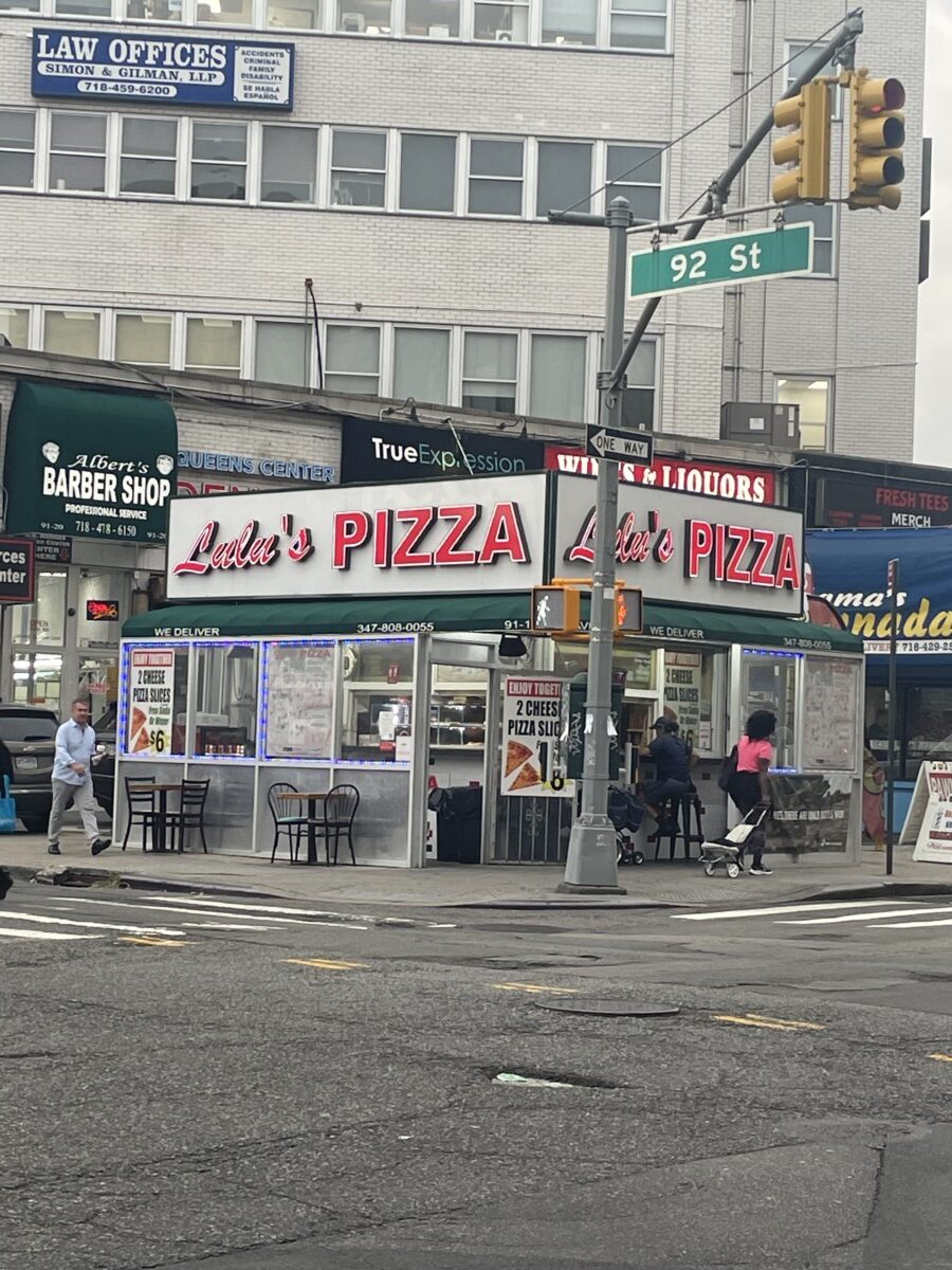
1)This pizzeria caught my attention for the fact that “Lulu’s” is written as script while “Pizza” is shown in a san serif typeface. However, what peaks my interest is how some small pizzerias usually tend to have a script font. When I think script, I think more elegant and bold. Bold for the fact that letters don’t just sit in a line, but tend to have other branches swirl. Now when I think pizza, I don’t really feel elegant or classy, some of them don’t look like so on the inside as well. It’s just a small irony. However, the contrast, i’m thinking that maybe the intent is for PIZZA to pop out. People would immediately notice the word pizza from feet or miles away. Therefore, having the word PIZZA in a clear and easy san serif font to read would attract audiences to go and buy.
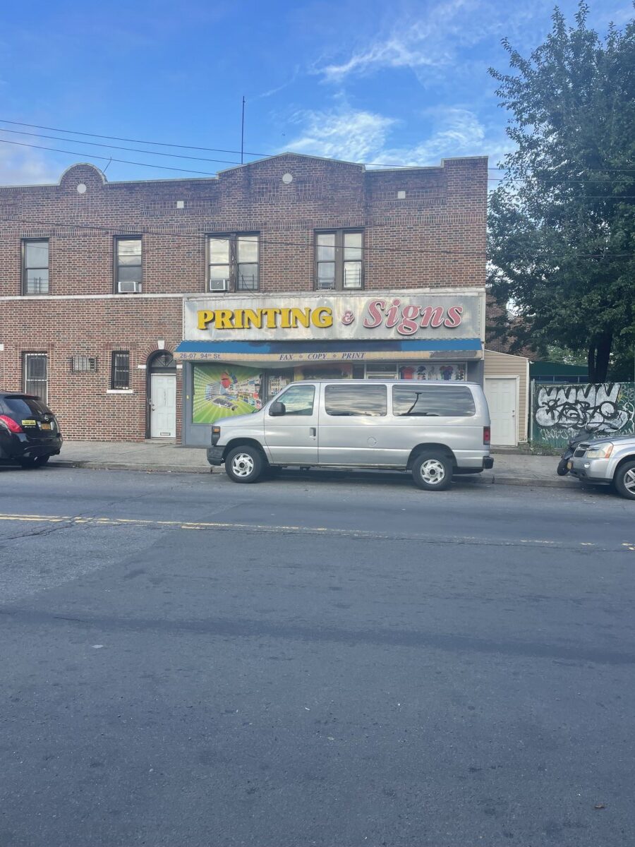
2) In this image we notice the sign stating “Printing & Signs” In all honesty, I always seen it while waiting for the bus, but have never bothered to acknowledge its typeface or font. What I noticed was actually creatively funny. I really liked how this sign was designed literally. The printing part is showcased in a serif typeface, just like how MAJORITY of things are printed with a serif typeface. On the other hand, the “Signs” part could have just been a serif font as well, but its clearly script, as if representing “signature”. It’s actually very creative. I think it does help out for the fact that it contrasts each other bringing attention to both. The use of both colors as well as vibrant so its quite impossible to miss, but I did end up missing it many times until now. In general, I wont say it’s probably the most BEAUTIFUL but the typeface choices is really a cackle, and most likely gets the job done for anyone who is looking for a place to print or so on.


Leave a Reply