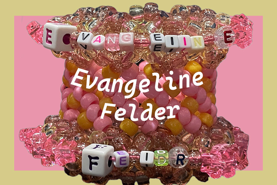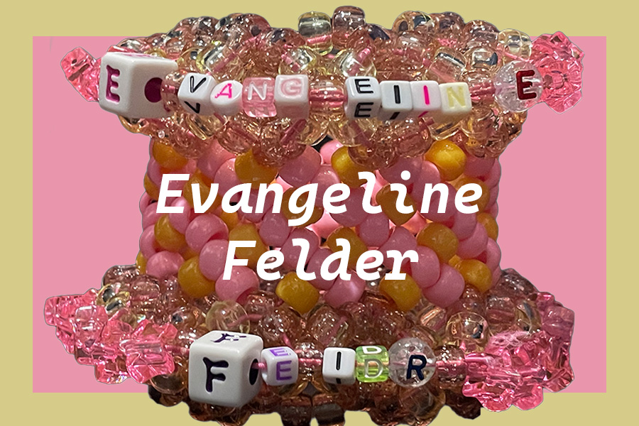
This time in order to improve my nametag and make it more readable. I simplified the text so there’s no outline and made it white so that there’s more contrast between the background and the text. I changed the font multiple times trying different combinations until i landed on the bold and italic version of Cascadia code because i like how it looked and how it reminded me of cursive. AndI pretty much only write in cursive. But also i curved my text to follow the curve of the bracelet. After that in order to create a contrast between the simplistic font on the beaded letters and the elegant of the italic bold version of Cascadia code. I also spaced out the letters slightly to try and make it even more readable. As it looked a little cramped in my opinion. But I kept the bracelet and color scheme as a sign of my interests and personality. Also, I made the bracelet bigger so that its easer to see both the typed text and the text on the beads.


Much more readable. You’ve packed a lot into a 3″ wide x 2″ high area.