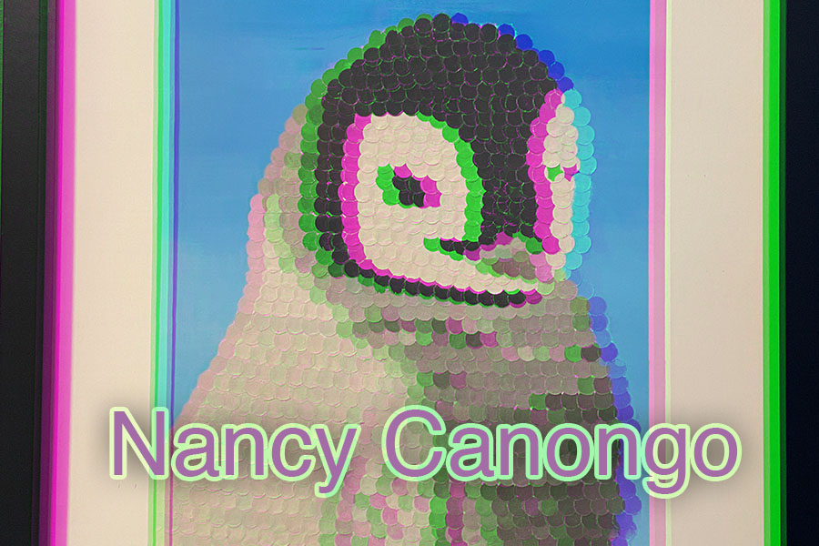
I decided to use an old piece I created. I was inspired by pointillism in this artwork. I also really love animals and found baby penguins adorable. The penguin artwork is actually one of my favorite works so far that its actually framed in my room. I tend to struggle in being a “perfectionist” so this piece really displays the attentiveness and time i spent on it. I wanted to give it a 3D effect because I’m edgy like that. All jokes aside, it really makes the penguins features pop out more and i really was just playing around. I then used Helvetica and tried to center it at the bottom. I used purple and green for the letter because its just my favorite color combination when it comes to art and all and in general just my two favorite colors. I went with a clean and simple typeface as to not obstruct the balance of the artwork behind. I also don’t like very “tryhard” typefaces and tend to stick with simple yet classy looks. Im an easygoing and simple person and really open to close people. I think the typeface highlights that.


Your penguin artwork is indeed adorable and attractive. You’re wise to choose a simple typeface. An important goal in the name tag, however, is to make your name clear and readable. Try using the same face possibly in white, possibly in a light shade of the green. That way, you’ll simplify your type AND make your name easier to see.