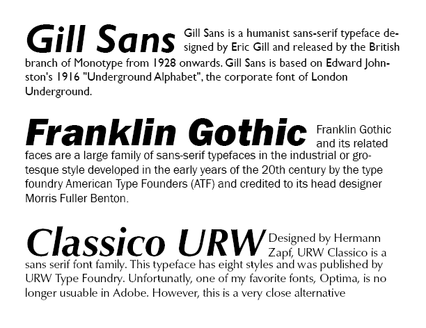
My current favorite typefaces fall into the Sans Serif family and are even further described as Humanist Sans and Industrial Sans. Fonts like Gill Sans, Franklin Gothic, and Optima fall into these categories and happen to be my favorite typefaces. I and drawn to the fonts with a little character while still being uniform, something clean that still conveys a feeling. These fonts can be used for text blocking along with headlines depending on the styling of the font (ie. bold, italic, etc.)


Sarah, “a little character while still being uniform” is an apt description. Years ago, when I chose a sans serif as a heading, in counterpoint to running text, a client requested something along the lines of your description, calling it a “personality sans.” Yours words are better, I thinks.
It’s good to see your examples, which are clear. Good for you. Moving further into the typographical weeds, think about how you can avoid hyphenating certain names or words, especially when you’re formatting flush left/ragged right (more on this to come!). Also, consider the space between lines (formerly called “leading” and now called “line space”).