I WANT THE SECOND POSTER PLEASE!!!!!!!!!!! NOT THE FIRST ONE OF DREAM
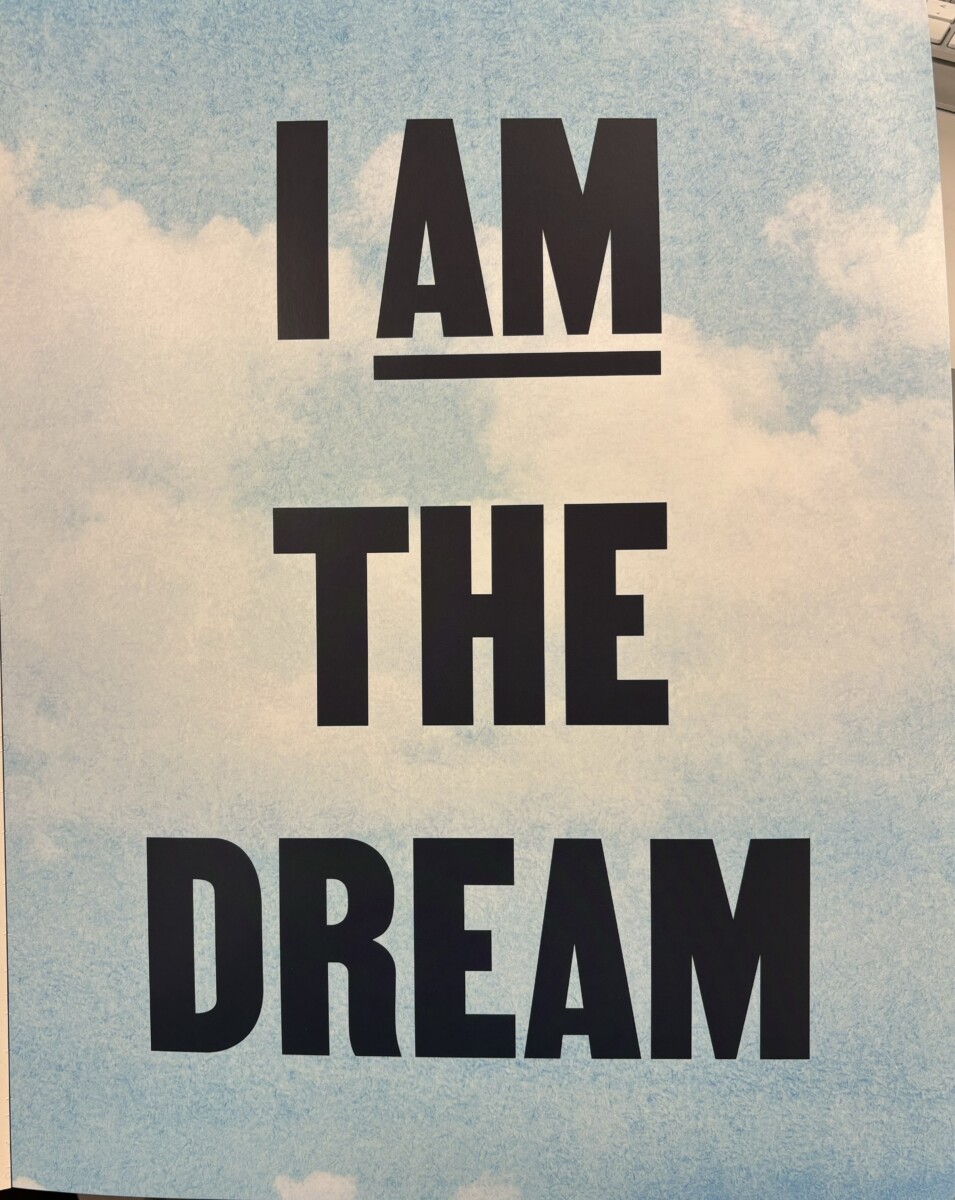
Besides it being the first poster page and catching immediately my attention, this poster is successful in my view because, while it may be simplistic with just text and a background, the meaning behind it becomes more saturated and obvious. We notice the background as a cloudy sky which must be emphasizing the word dream. I like how the background compliments the quote. The type is bold and eye catching screaming in caps, yet not dramatic. its readable and yet the background doesn’t distract and neither does the type. A very inspiring poster to wake up to everyday I would say.
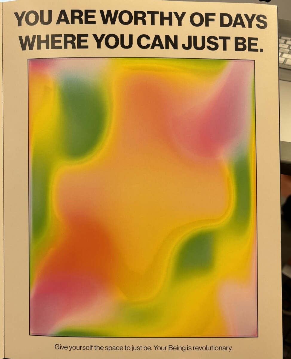
I really LOVED this poster specifically. Maybe because it has the color green. Jokes aside, I feel like I am lowkey looking at a weather forecast, but yet, i somehow feel like its suppose to be a mirror somehow. I noticed the type is a very uplifting quote. We notice a heading the top type in bold and caps which gravitates our eyes to it. We then notice the small type at the bottom as if a little petite reminder. I really like how this poster came out. The message is really conveying and looking at the center makes me want to reflect. Hypnosis?
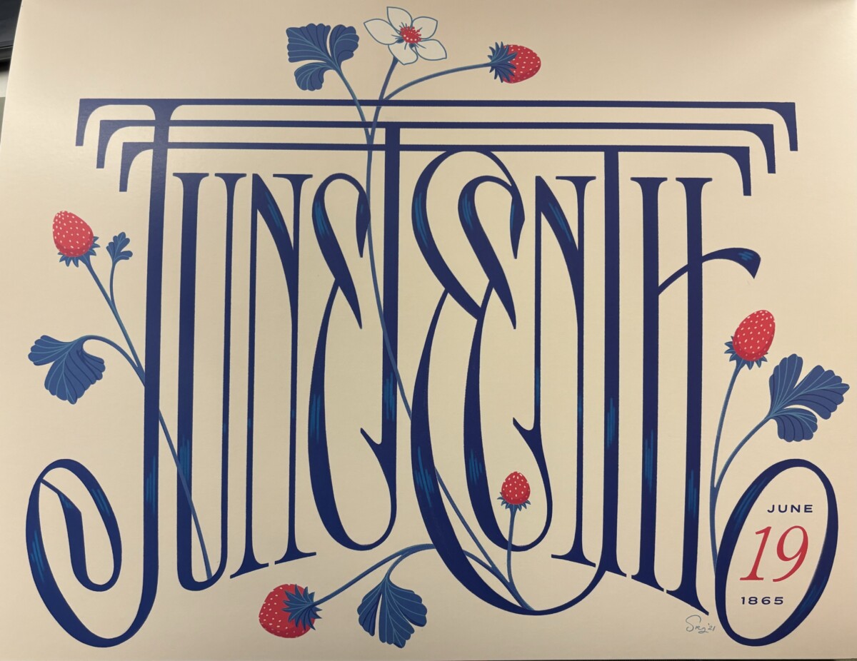
This poster, i assume the type to be script. I was first confused because the type is kind of hard to read. However I like the added color of red. It livens up the poster and gives it more feeling, contrats I guess. This isn’t a huge favorite but it really is beautiful. The letters are a bit to close for me and I just generally cant read script.


For the “Juneteenth” poster, it’s worth noting that sometimes a design that’s a challenge to read can be a good thing.