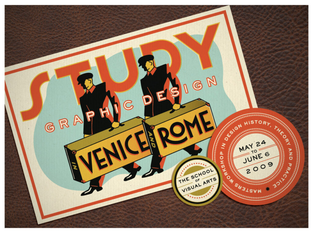
I chose Louise Fili because of the vintage feel. I also enjoy her use of texture, color, and shape. The design above particularly stood out to me because of the colors she used and the case’s texture. Most of the display text looks like Portofino, one of my favorite typefaces because of its groovy movement. I also enjoy her use of patterns in her many other designs!


Interesting to see Portofino coupled with “groovy.”