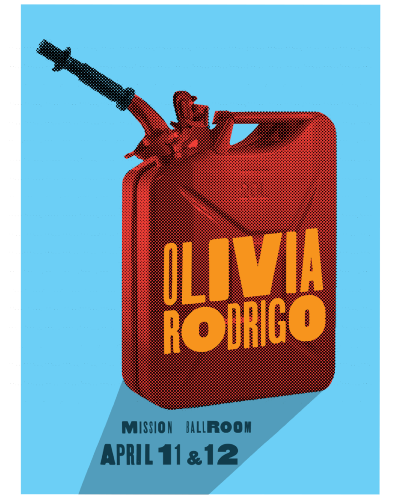
i chose to focus on this work

by Rick Griffith and Debra Johnson. I really liked how they uses the shadow to sort of Sudably point to the important information. I also enjoyed there use of color and ho it improves the legibility of the poster. i also think the varying sizes of the individual letter forms give a cool look almost like a ransom note or just a collage.


Leave a Reply