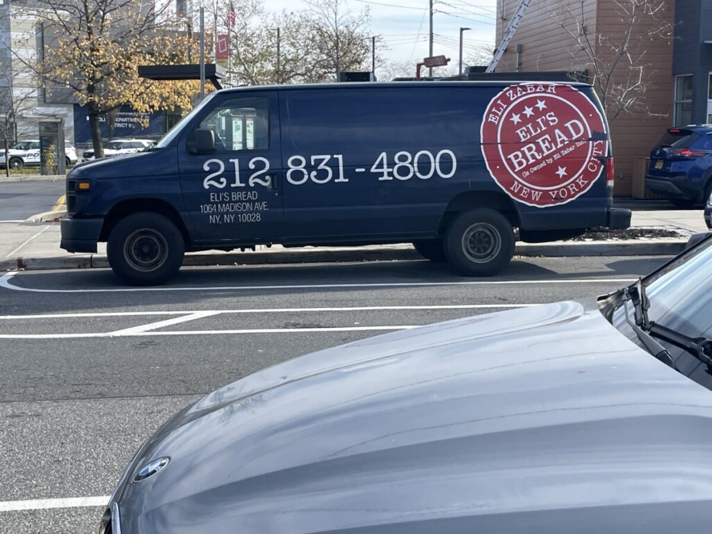

for the brea one i think the font could use some work especially on the numbers its just giving like first font we say type look you know? But i like the red logo it reminds me of like a sale sticker so i think it goes well for a grocery store food. and weirdly enough even though its the same font i think it works better on the “sticker” logo i think it goes well with the rounded look.
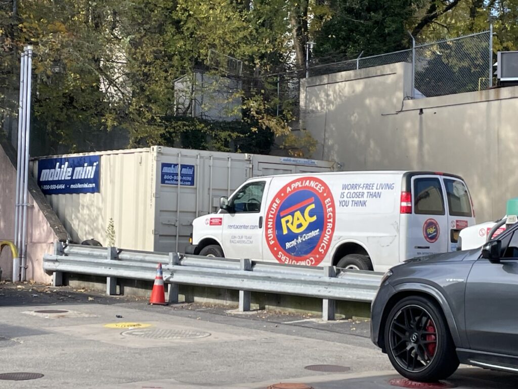
for the rac truck i like the font i enjoy the ra connection but dont think it really does much to explain what the company does but the logo and type really stand out due to the colors


Leave a Reply