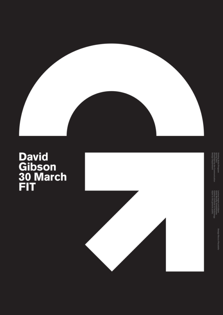
I chose this poster in particular due to the simplicity of it. Not only is it a simple poster that is pleasing to the eyes, it is also very creative on how the G is formed. The bottom part of the letter G is an arrow which holds meaning as to who David Gibson is. Gibson’s line of profession is within the field of environmental signage, which goes along with the arrow since that is also used as a sign.
KEY INFO
Professor
Beth Tondreau (Mary-Elizabeth)
Email
mtondreau@citytech.cuny.edu
Office Hours
Tuesdays and Thursdays from 11:00am to 12:00pm, Pearl-116 (after class).
Course description
A foundation course in typography with emphasis on using type in industry-related applications from print to interactive. Students will be introduced to principles of type design and terminology
Search this Course
Find Library Materials
Library Information
Ursula C. Schwerin Library
New York City College of Technology, C.U.N.Y
300 Jay Street, Library Building - 4th Floor
OpenLab Help
Sharing
Logged-in faculty members can clone this course. Learn More!
Acknowledgments
This course is based on the following course(s):


Leave a Reply