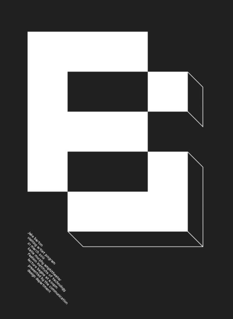
I chose this poster to talk about because I feel its more on the playful side. Looking at it at first I liked the cubic lettering. Then when I read the description they spoke about there being a letter ” J ” made into the letter “B”. Taking one shape to help incorporate it into another is something i would want to work on, to expand with my work. I feel as though this type face is San Serif and boldness to it. There are fonts that are just like the one above, more like a robotic type.


Leave a Reply