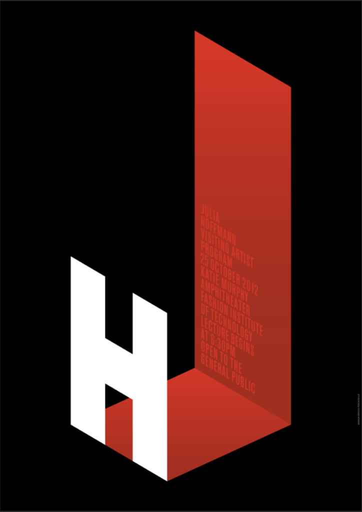
The first poster that attracted my attention was by Julia Hoffmann Fall 2012. When looking through the posters it was the first to use the bold color of red. After reading the description confirmed my inference that the red looked like a room. Further more the H forms a doorway into the red room, I really enjoyed it because it was imaginative and ingenious, it was in nice use of San Serif Typeface.

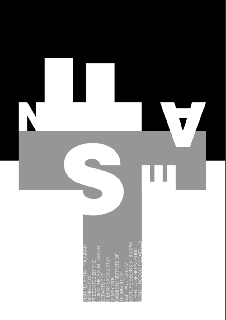
The second poster I was attracted to was by Stefan Sagmeister Spring 2010. I found the playful and innovative on typography. I really liked the idea that the longer you looked at it, the more it became clear getting more from it. I think Stephan’s work definitely achieved his desire and purpose to evoke a new way of thinking, through the rotation and placement of the bold San serif typeface.


Rocco Piscatello successfully evoked the way Stefan Sagmeister shakes things up.