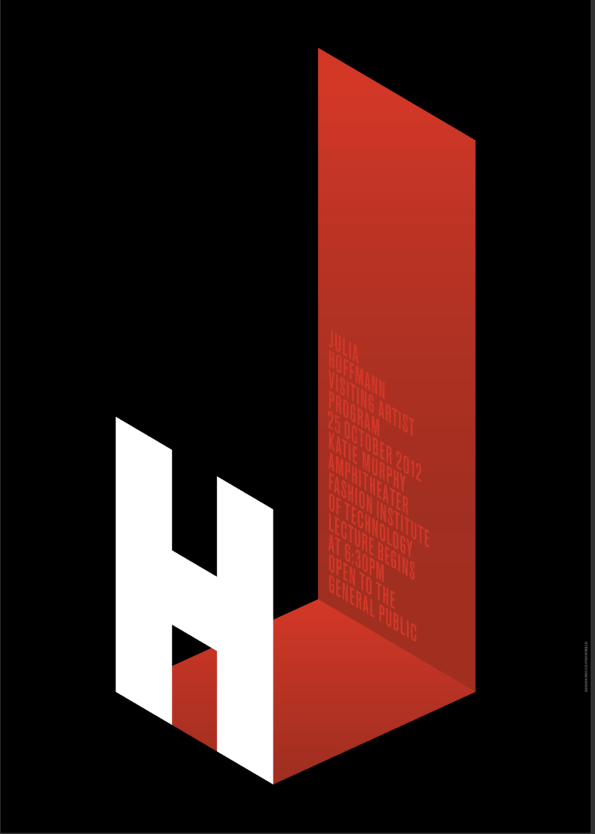
Out of all the emails presented I was interested in Julia Hoffman’s work. Reason why is due to the use of 2-dimensional shapes to turn into an almost 3-D look, the use of red gradients also captures my eyes to the condensed font that is subtile yet captivating.


Leave a Reply