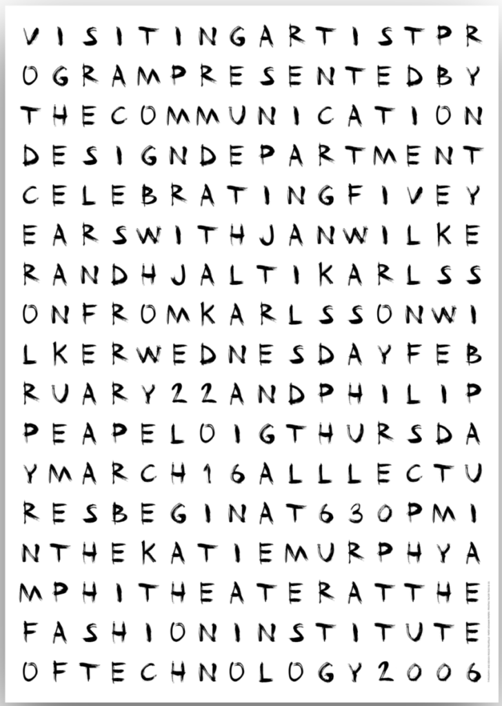
The main reason I chose this type was because of how cryptic it looks and how much it reminded me of some cryptic letters a serial killer sends to the police station to mess with them-
Aside from the creepy criminal justice vibes, the more I looked at this poster, the more I started to realized that there are actually sentences. It feels almost like a word search. The type is a custom type made wit India in and brushes. All the type is hand painted.

Ah, Jessica Hische… the name I forgot about this morning. Don’t worry, it came back to me after seeing her work. This is very much her style with the calligraphic lettering on the left side of the “H.” The whole “H” letter is a sans serif which I think is a good contrast with the beautiful elegant lettering Jessica uses to advertise this event.


Good descriptions (and memory jog!).
Rocco Piscatello has done a brilliant job of typographically impersonating the signature attributes and styles of designers in his speaker series.