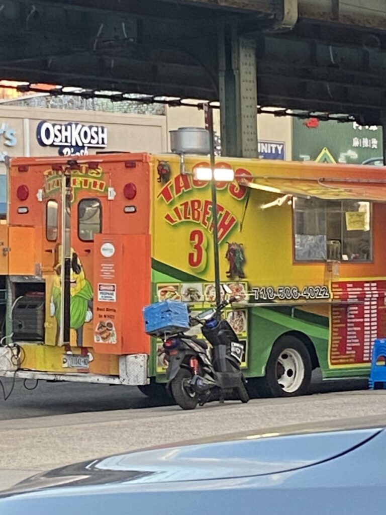
This taco food truck has a very fun appearance, as most food trucks do. The type is a warped sans-serif with a shadow behind it to give it depth. I think it’s successful in getting the job done.

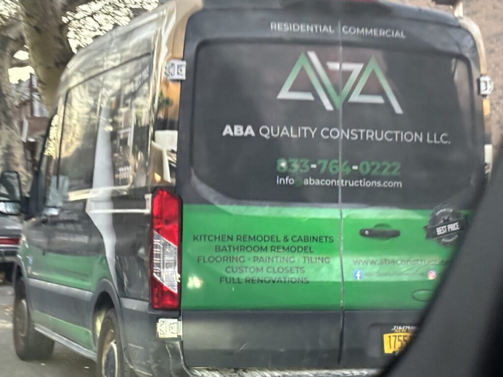
Sorry for the blurry image, I caught it while my mom was driving by it. Unlike the first image, the truck or van isn’t as colorful and fun. The take on the design is more modern and delicate. I do think the type is a little light/thin, but since the white type is on a dark background it’s still readable.


Leave a Reply