Quote
“It’s not a problem of being a woman in a man’s world. It’s being a type designer in a world that gives little recognition to this art form”
It seems like an obvious choice to choose this quote, but it is so true and I relate to it very much.
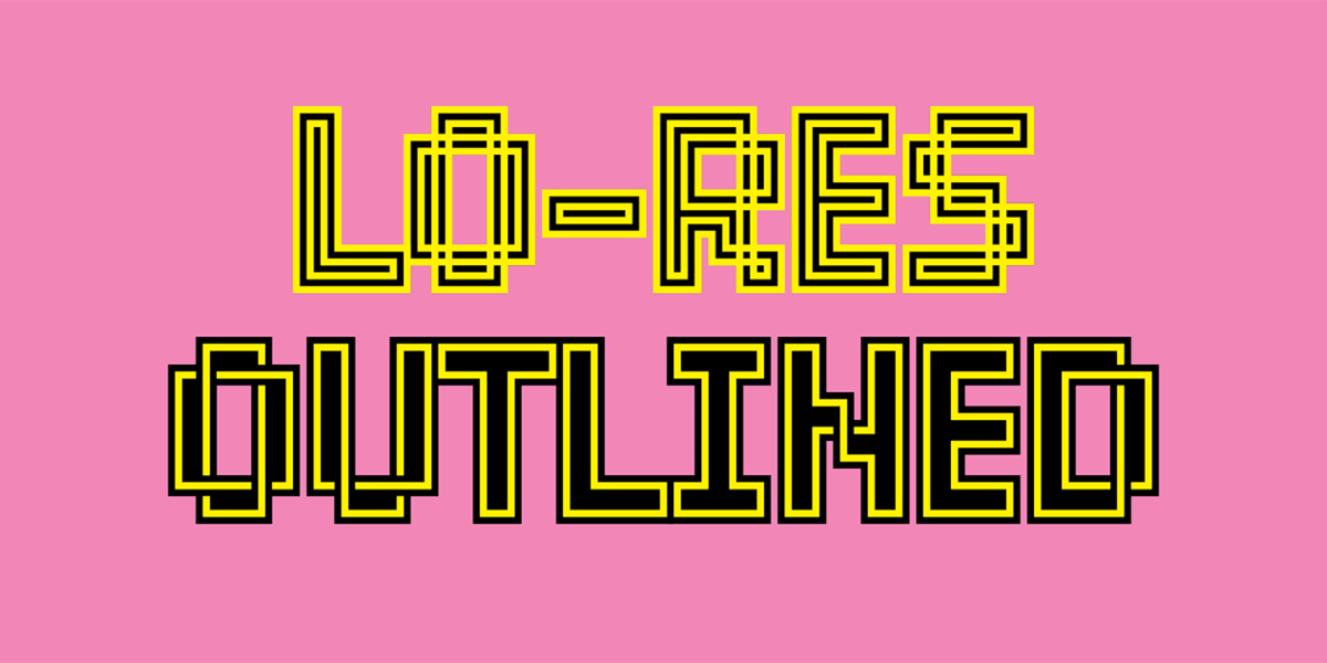
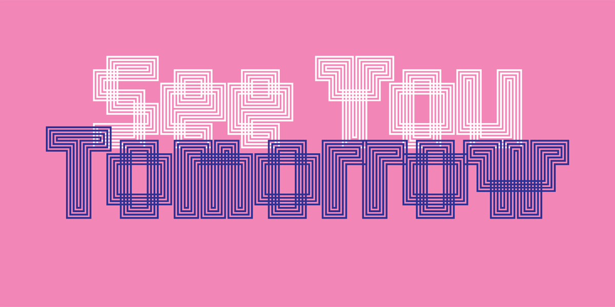
Lo-Res Outlined
The most visually arresting font from Zuzana Licko for me is “Lo-res Outlined.” This font is illustrative, decorative, detailed, and geometric (all of my favorite things for designs to include!). The colors used in this specific design are contrasting and add dimension to an otherwise 2D surface. Below are some examples of this “maze-like” font in use. Again, I love the colors and detail in these.


” . . . a world that gives little recognition to the art form” definitely is a striking quote.
Good that you were able to narrow down a favorite. It’s no easy task to choose a favorite font by Zuzana Licko. She’s created so many memorable ones.