This might be unrelated, but Zuzana Licko seems like a fun person. I say this because I think in order to make a fun font like Licko did, you’d have to be a fun person. Also, she looks very sweet in that adobe image of her 🙂
Rant aside, I found the comment Steven Heller made about Zuzana and her font quite admirable and endearing. He said “VanderLans used them in layouts that rejected Swiss modernist rigidity in favor of improvisation . . . By exploiting the limitations of the computer, they also developed a typographic language that challenged many established tenets of typography, including readability and legibility.” Zuzana’s font helped open the gateway to more improvised and fun fonts as well as challenging the rules of font making.
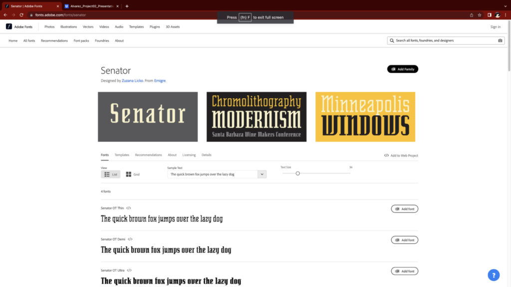
Other than Lo-Res being a fun and interesting font, I also found Senator quite interesting. The font almost looks like a calligraphic slab serif that also has a old-style feel to it. The sharp angles and off edges makes it cool and of course, unique. Also, weirdly enough the font feels very Senator. There’s no other way to explain it. It’s just Senator.

(I really like how Demi and Ultra look.)


You’ve highlighted great quotes.
* * *
“It’s just Senator.”
So much more clever than “Just Ken.”