Image Credit: Type Drives Culture; Multilingüe
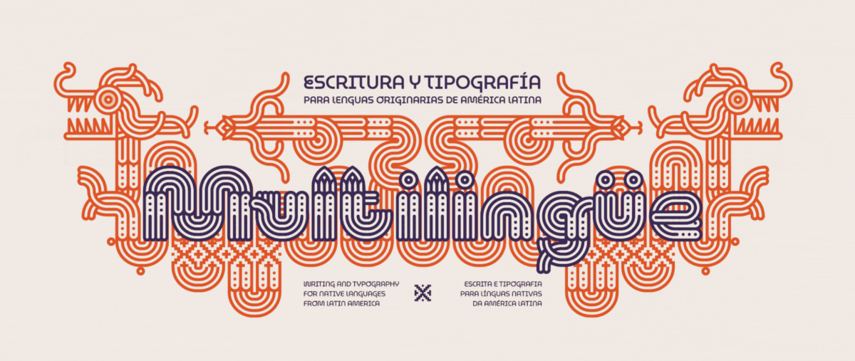
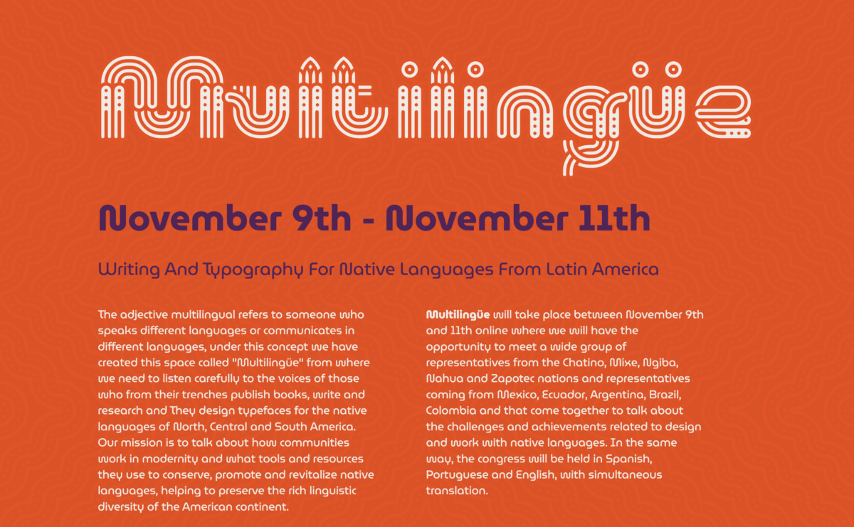
I appreciate the individuality and uniqueness that is expressed graphic designs and typography. Over all i feel quite neutral. the graphic/ animation wasn’t difficult to read but i definitely didn’t understood what it said right away. The neon colors used in the website are valiant and bold. I like the colors palettes and they did have good contrast between the font color and the background, providing legibility. However for me it was slightly overwhelming. I did however like the font in the paragraphing, it was unconventional and unfamiliar in a good way. The font is consistent with the concept of of the website, the illustrations, and subject of the conference.


Leave a Reply