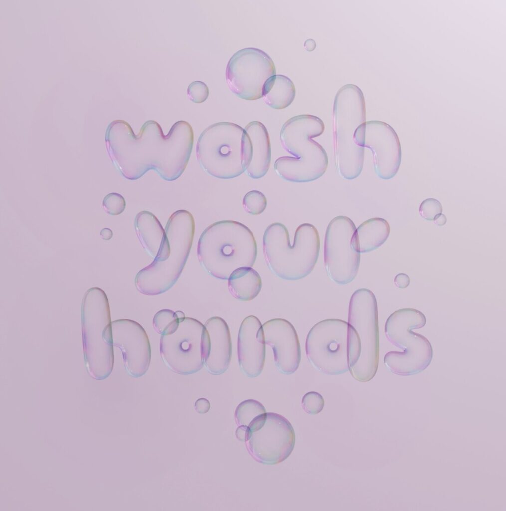
I chose “Wash Your Hands 3D” by Jessica Hische. What i find successful about this piece is how she used something that relates to washing. Bubbles tend to form slightly when one washes their hands so i think it was a cute asset. It could have been water or soap but bubbles was just a more cutely approach. I would like to have this sign in my bathroom for the AESTHETIC. I 100% think this is useful and conveys its message. Instead of those INSULTING mean signs this one seems more welcoming and the use of color really allows it to pop out. No one can miss this. What i find appealing about the style of the artist is just how CLEAN AND PRETTY IT IS. I skimmed through all her work and i would loooooove to buy stickers of hers to just randomly stick around. Her work is really nice and looks too perfect. Would make me go broke if i saw such labels on items. Especially the christmas ones, just chefs kiss.


Great comments, Nancy. You’ve focused on how playful type can convey a lot more than stern and predictable type. I agree that Jessica Hische’s work is really, really nice.